Happy Wednesday, friends!
We realized that in all of our new website and blog launch excitement last week, we basically just published, said HERE YOU GO, IT’S REAL PRETTY, and collapsed onto our respective couches with a much-needed cocktail.
Now that we’ve had a chance to recover, we thought we’d take you guys on a little tour! We launched the first version of our website in 2013, and as we learned about user experience (UX) design and the importance of making things functional as WELL as pretty over the last few years, we began to realize that we’d approached some things… uh, shall we say “entirely, somewhat embarrassingly backwards.”
So, we want to clue you in on some of the behind-the-scenes planning and strategy that went into the new site, talk about the issues we corrected, and of course, share our favorite parts of the design. Because we’d like to think it’s still pretty, even though it works real nice, too.
We’re going to do this MTV Cribs (or Fixer Upper, if that’s more your bag)-style; so come on in, friends, and let us show you around our new piece of online real estate.
![]()
First stop: The Homepage
One of the main issues with our previous design was that while our home page was cool, unique and vibe-y, upon landing on it, the average customer had NO idea who we were, what we did, or what our product was.
…Uh. Yeah. Moderately problematic.
So, what’s the first thing you see when you access our new site? “Customizable websites for the modern, stylish creative.” Boom. When you scroll down a bit, you’ll next see, “We’ve redefined the website template…” Boom. Clear identity, clear statement of what we are, who we’re for, and even a hat tip to what we’re not. No more clients wondering if they’re in the right place, or if they just stumbled into some sort of bar.
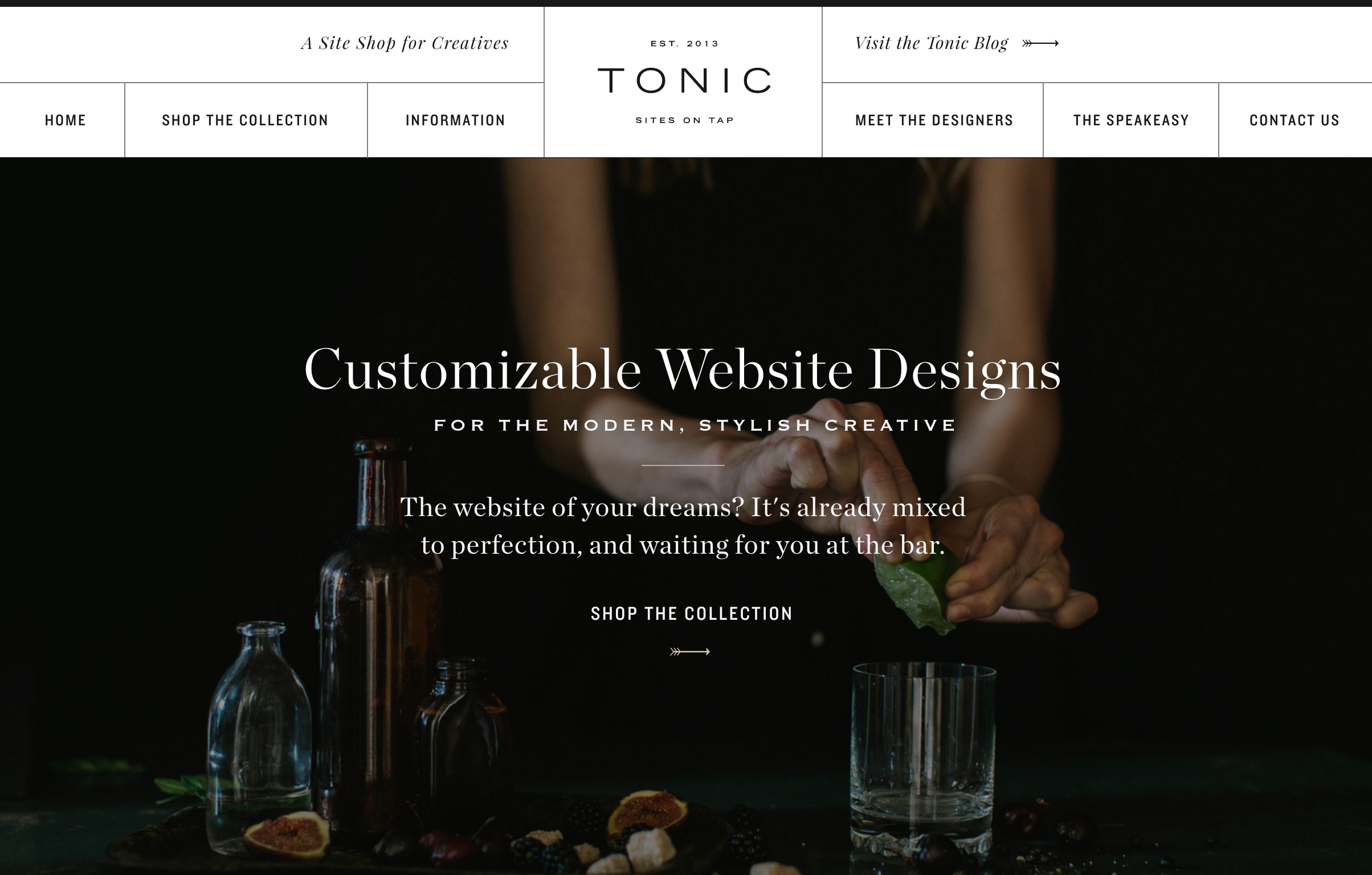
After the viewer finds out what we are and who we’re for, we wanted them to know what we offer. That’s where our handy little collection preview comes in. You get immediate access to a dynamic, user-operated view of our product, and below that, you’re given a “Start Here” section to click through to the most important areas of the site. So if they haven’t clicked through yet, they’ll do so there! Below that, we have our first of THREE different areas of reviews and kind words. On our previous site, we didn’t have any place to feature thoughts from our clients or influencers in the industry, and those recommendations are practically worth their weight in gold… not to mention the fact that they sell TONIC better than we ever could!
Around the corner: Meet the Designers
Since our TONIC brand reads kind of high-end-luxury-cool, our about page needed to make it clear that personally, we’re anything but. We’re outgoing, friendly, and have some deeply nerdy roots (hence our first person bios and somewhat silly fun facts). We also wanted it to tell a little about our story, since we love sharing the friendship and collaboration at our roots.
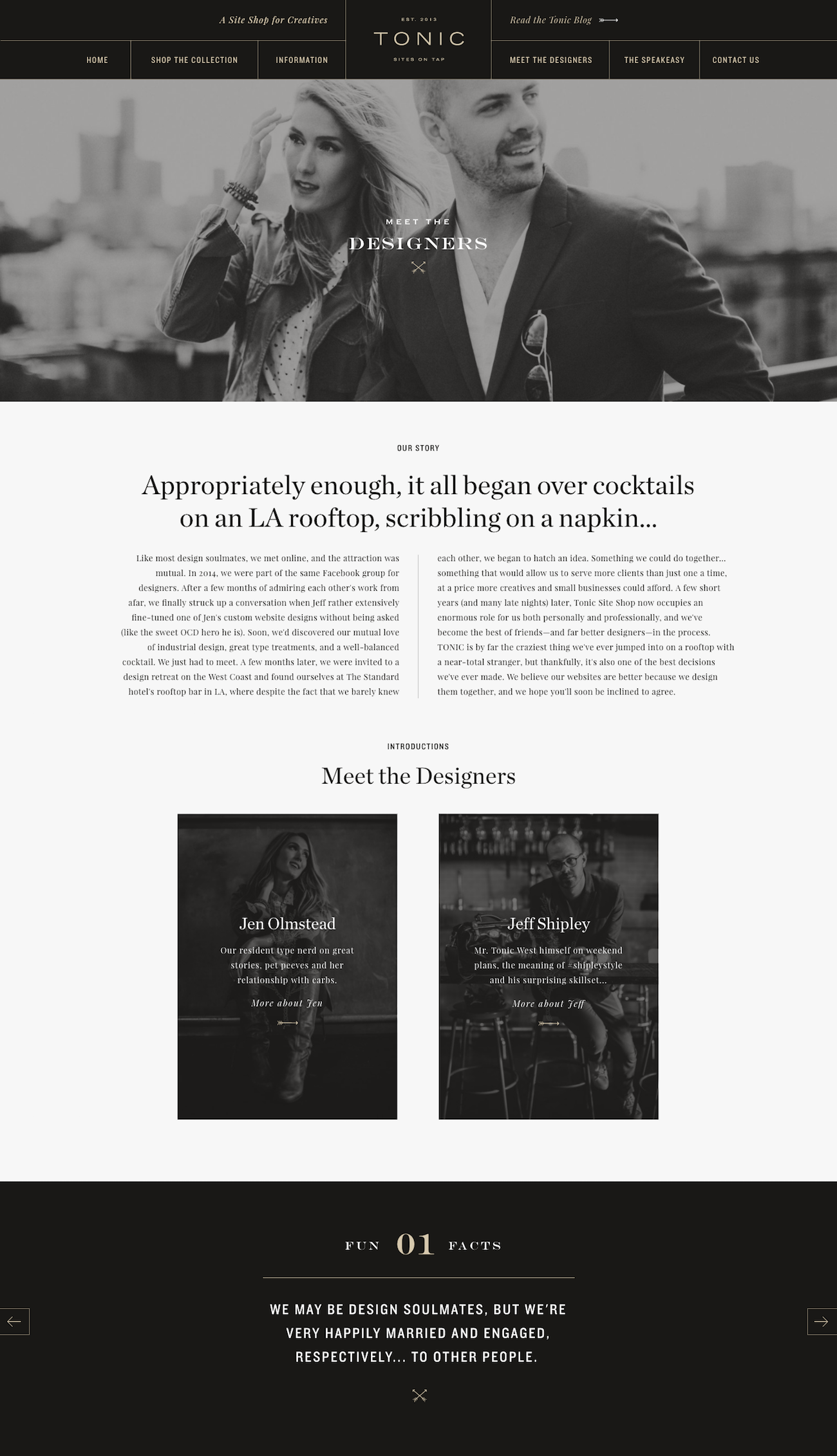
And we knew we had to keep our fun “His and Hers” grid design from our original site, since we LOVED that (proof that you don’t need to throw everything out when you update a design).
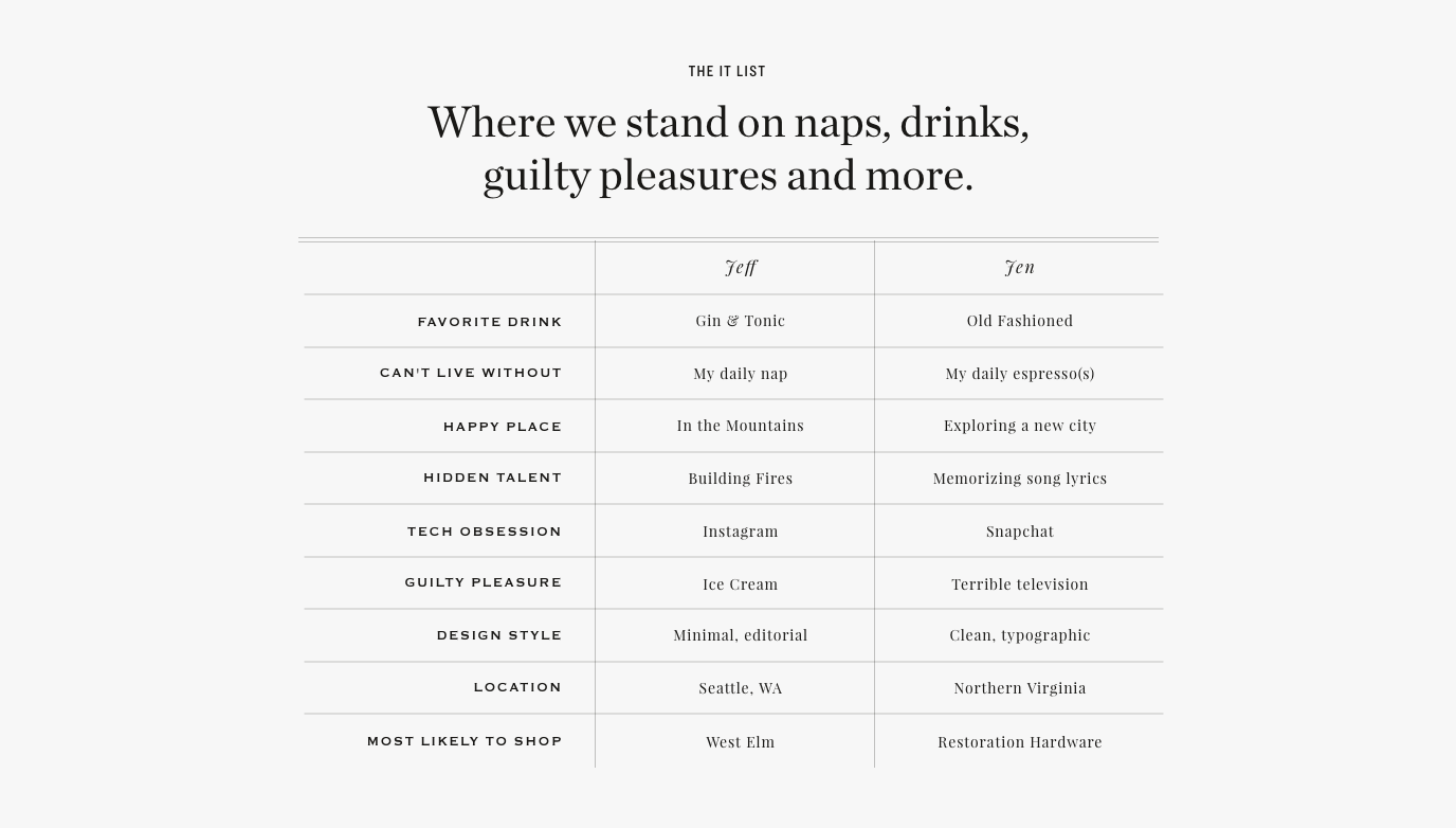
Bonus: We FINALLY had a place to make it clear, once and for all, that we’re not married OR romantically involved. Just design soulmates for life, everybody.
The “Kitchen:” The Site Profile Pages
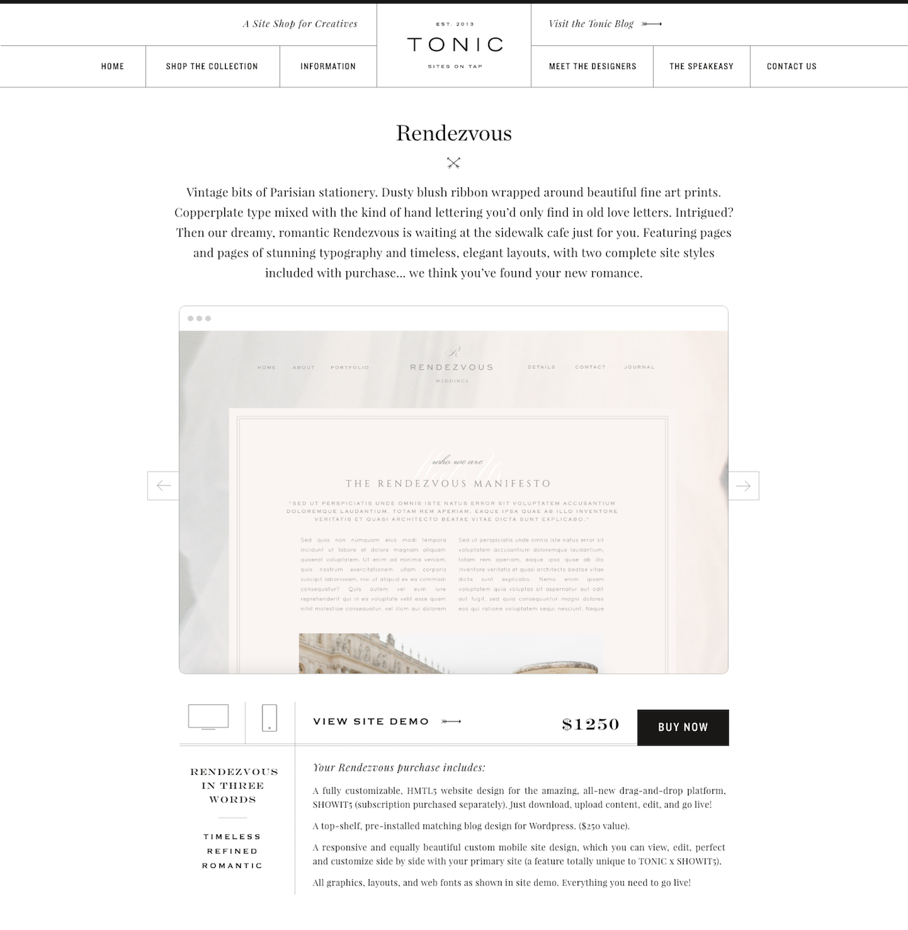
Oh man, is THIS an improvement, and definitely the beating heart of our new design. On our last site, we really struggled with showing our designs at their best, since space was limited and we weren’t sure what information our clients really needed before they bought. We didn’t want to overload them with content, and so even the images of each site were small and kind of dinky. Not to mention that once a client decided to buy, they actually had to leave our site and go through a separate shopping cart process, giving them more time to decide maybe they didn’t need a new site after all.
Thankfully, due to the all-new SHOWIT5, we now have unlimited space to provide all the information about each site in once place… spread out for easy consumption, with gorgeous site preview and a SWEET mobile / desktop toggle to boot. Our clients can preview the site, get a glimpse of the mobile version, view the site demo, find information on all of the site features, learn about the platform, see additional sites they might like, and click to buy, all in one place. It’s the ultimate site shopping experience, and we can’t believe it’s OURS. *happy sigh*
Our favorite parts:
Jeff : I have to say that my favorite part of our new virtual digs would have to be The Speakeasy page. It definitely addresses the “Now what?” question and gives people a sense of how we can help cure what ails their website. I love how it showcases how highly customizable our site are and how with the drag-and-drop features of Showit 5 Tonic Regulars have adapted the original designs to fit them perfectly — no boring, ordinary websites in sight here friends.
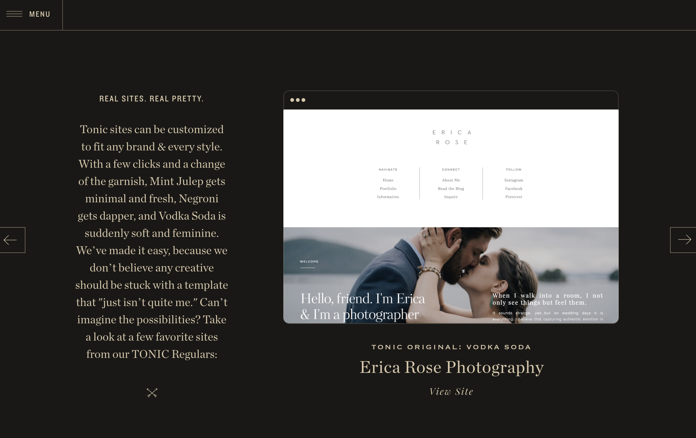
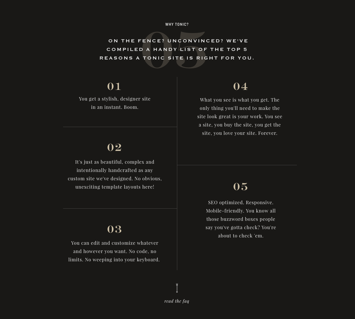
Jen : I love the design of the Speakeasy page, since that page was where I really felt the aesthetic come together, but I love the ease and content on the Information page! It gives such a great peek into what we do, why we do it, and how we can help… plus, give me a grid with giant numbers, and I’m a happy girl.
A few parting words of advice / pro tips to take with you as you makeover your own website …
- Clarity is key. Have a clearly visible statement about who you are, what you do and how you can help. Don’t expect the aesthetic alone to convey that message for you.
- Make it easy to connect. Have an easy and almost annoying obvious way for viewers to get in touch should they like to. We have our contact info along with social media links on every page in our footer as well as a link to our contact page in the main top-navigation. No ending up locked out the side-door, my friends. Plus, we made our contact page so pretty it’s actually fun to fill out!
- Think through your voice: What kind of connection are you hoping to make? If it’s very personal and friendly, consider using the first person. If it’s more high end, luxury or fine art (or not a personal brand at all), then it’s weird to use first person and you’ll need the professionalism of third (and watch it on those exclamation marks).
- Tell your brand story. People love hearing about how it all started and why you do what you do, so don’t be afraid to tell a few tales in your about section so people can get a sense of your history. Just no tired “I first picked up a camera when I was five years old.” Okay? okay.
- That’s what she said. Kind words from your clients give you street-cred, allow people to imagine what effect your product or service can have on them, and besides, it’s often more powerful to let them hear it from someone ELSE than just from you.

