It’s a new year (WE MADE IT, friends!), and while everyone is busy thinking about their New Year’s resolutions and goals (and we probably should be, too), we’re over here thinking about how to help you have your best website ever this year.
And we don’t mean you need a whole new website. (Whew!) When it comes to website design, it’s the typical approach to go all or nothing — first, a GIANT launch or rebrand with giveaways, countdowns, and Instagram confetti galore, then *crickets* until you feel like you’ve got bandwidth to tackle things again… or the PTSD subsides. Whichever happens first.
But we’re here to break that sad little cycle — and restore some confetti-level confidence in your website — with some simple things you can actually do — to improve your online presence and get your website “in shape” for the new year. Think of these tasks, questions, and checklists as tools you can use to tune up and tone up your website for maximum gains. We guarantee the sense of accomplishment as you work through each step, regaining confidence in the way you look online and feeling better than ever about how your website works with and for you. Ready?!
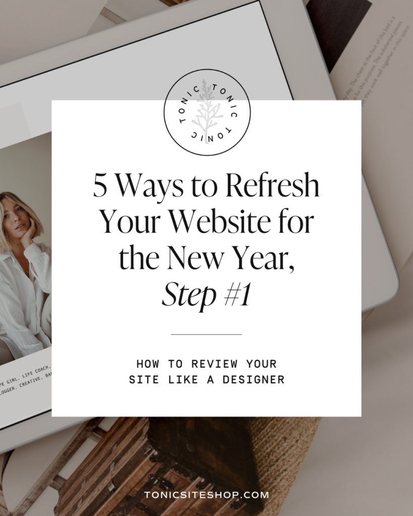
Here’s Step #1 — Review Your Website.
When was the last time you really looked at your website?
One of the most common problems we see online is website neglect: a small business owner launches a new website, then doesn’t touch it (or even look at it) again until the sudden urge to rebrand strikes three years later.
But like great businesses, great websites aren’t just made: they evolve. They should grow, improve, and change to fit their owners, who are growing and changing, too.
So, if you haven’t really looked at your website lately (and really, even if you have), let’s start there. Open your website and browse every page with fresh eyes. Here’s how to assess your website like a designer:
1. Evaluate the information you’re providing
First things first. Comb through your copy and information.
Is anything outdated, irrelevant, or no longer true? Are you missing newer information, more recent reviews, or accurate data? Is your site selling products you no longer offer? Has that “coming soon” section been up for, uh, a really long time? You’d be surprised what kind of hidden “gems” lurk in the corners of even good websites.
This is about establishing credibility and client confidence in you and your brand. If a visitor discovers incorrect or old information on your site, they are more likely to bounce to another site… they can’t be sure your site’s up to date, which instantly creates a question mark as to whether or not they can trust what they find there. People also just crave new information. Original, current, and engaging information not only attracts new clients — it also helps keep current clients loyal.
Original, current, and engaging information not only builds trust that attracts new clients — it also helps keep current clients loyal.
2. Consider whether or not your websites speaks to your ideal client — like, who and where they are, right now.
If your ideal client had your website open alongside 20 other tabs, would YOURS connect with them… and connect with them within the first .08 seconds? If so, great (and keep this going. Do more of that) Please proceed to question 3.
3. If not, why not?
Does your site say anything or is it just inoffensively pretty? Does it show you at your best and what you do best? Does it set you apart? Does it make the user feel confident you can help them achieve what they need or solve a problem for them? Can it do any of those things better?
Work in this space for a bit until you can confidently answer these questions in a way you feel really good about.
4. Incorporate better points of connection
Are there simple changes you can make to your images or copy to provide better points of connection with your ideal client? Can you add a little bit of your unique value proposition (UVP) to your about page, or showcase images that feel more like you and the work you love to produce?
5. Is your site (and your offer) totally, caveman-proof obvious?
If you landed on your website for the first time as a client, not as someone who’s been there before, would you understand — first and foremost — what you do and for whom… and secondly, how to navigate through the site content?
Does your site flow from one place to the next, with clear direction, or are you providing too many things to do and places to go at once? Or does each page feel like a dead end, without any steps forward?
If these are not clear, make them obvious. You know what you’re offering and where to find content on your site, but it should be straightforward and intuitive enough for any visitor.
6. Invite your visitors to do something.
Related to #4: are you missing the calls to action (CTA)?
No matter how pretty your site is, it’s really supposed to be a tool. Its purpose is to generate interest in you, your work, and your services… interest that compels clients to contact you.
The best way to do this is by inviting them to do so! Add a note at the bottom of your portfolio page compelling them to get in touch about their date. Add a button under “Reviews” (your best social proof) letting them know you’re accepting bookings for 2022. Don’t leave it up to them to reach out — extend the offer yourself!
These simple tasks make all the difference. We’ve seen websites (and their makers) go from feeling “blah” to 💃 just by tweaking the copy, shifting the message, and having all the right information. These tools are often the difference between having a website you avoid working on (hello, Procrastination, our old friend), to one you actually love updating. Why? Because it works. You will gain confidence (and clients!) when your website represents you and your brand in the best way, and that’s a New Year’s goal we can 100% get behind. We’re here cheering you on. You. Can. Do. It.
Ready for the next step? Learn how to REFRESH YOUR ABOUT PAGE in step #2.