Whether you’re showing up on the main stage, at an online event, or just your Instagram stories, knowing how to present and speak with confidence can be a superpower for your business.
(Especially because it’s most people’s kryptonite. 🙅🏼♀️)

Okay, so… define presentations.
By definition, a presentation is a speech or a talk in which the speaker shows and explains a new idea or piece of work to an audience.
Now, let’s be clear. The size of audience doesn’t matter here. A presentation could be for one person in a boardroom or for 1000 people while presenting on stage. It could be a virtual masterclass to hundreds or a 1:1 client meeting.
So what makes a great presentation?
The way we see it, the recipe for a perfect presentation is:
- A topic that the audience is interested in learning about (which, frankly, could be anything — all it takes for your audience to become invested is the 2 other ingredients of this perfect presentation recipe below)
- Engaging speaker who knows how to simultaneously entertain and inform a crowd (we’ve got tips for how to get on that level right here!)
- Aesthetically pleasing slides (that don’t take away from the presenter’s overall performance on stage, which we’ve also got for you right here!)
While we’re both biased and confident enough to say that your presentations will automatically be 10x better with our Canva slide deck templates, we *do* also have REAL advice for creating better presentations.
(Well, actually, the advice is from our friend and expert speech coach, Mike Pacchione, but we’re defaulting to whatever he says because he’s the best of the best.)
→ Speak to your audience like you’re reading them a children’s book.
Entertain with the same energy you would a child, by acting things out, modulating your voice, using bigger gestures than you think you need, pausing for dramatic effect… you get the picture.
→ Push your audience into the pool.
Launch into a great story, or make a strong statement, or ask a question. Surprise attack them into being interested, as opposed to easing them into it.
→ Don’t take your audience scuba diving when they should be snorkeling.
Amateur speakers often try to deep dive when all they need to do is skim the surface. Give your audience less information while making it more interesting, then give them a way to connect with you to follow up after your presentation to continue providing value.
(A deep dive, although one of my favorite things in the world—hence the length of my Instagram posts and newsletters and this post—has no place in a presentation, because it just feels like WORK, and your audience will check out.)
→ Use your slides like a comic book.
Think of them as individual billboards, visually guiding your audience through the presentation alongside the story to support the narrative (not distract from it).
One of my favorite pieces of Mike Advice is that “whenever you’re asking your audience to take more than a second to read something on a slide, what you’re really asking is for them NOT to listen to you.”
Read the rest of our advice right here!
How do you create a good outline for your presentations?
When creating an outline for your presentation, the first thing we recommend doing is determining the purpose of it.
⭐️ What’s the topic you’re educating about?
⭐️ What does your audience need to know about it?
⭐️ What are the main takeaways of the presentation going to be?
Once you’ve solidified those things, you’ll be able to build everything else in your presentation outline from there.
You’ll want to make sure your presentation outline has:
- A good, attention-grabbing hook — first impressions are everything, so a compelling introduction to your presentation is necessary. Your goal is to make your audience want to listen to the next line, so start off with a captivating statement or intriguing personal story.
- A story worth listening to — use stories to illustrate your points, instead of solely using statistics and facts. Stories are drastically more memorable. And they have a unique ability to release oxytocin, creating a chemical bond between the story and the listener, which will ensure your message deeply resonates with them.
- Effective slides — not slides that take away from your presentation. Our friend, Mike, loves to use “The Billboard Test” – would your audience crash trying to read that slide if it were a billboard they were driving by? If yes, cut it down.
& while we’re on the topic of slides…
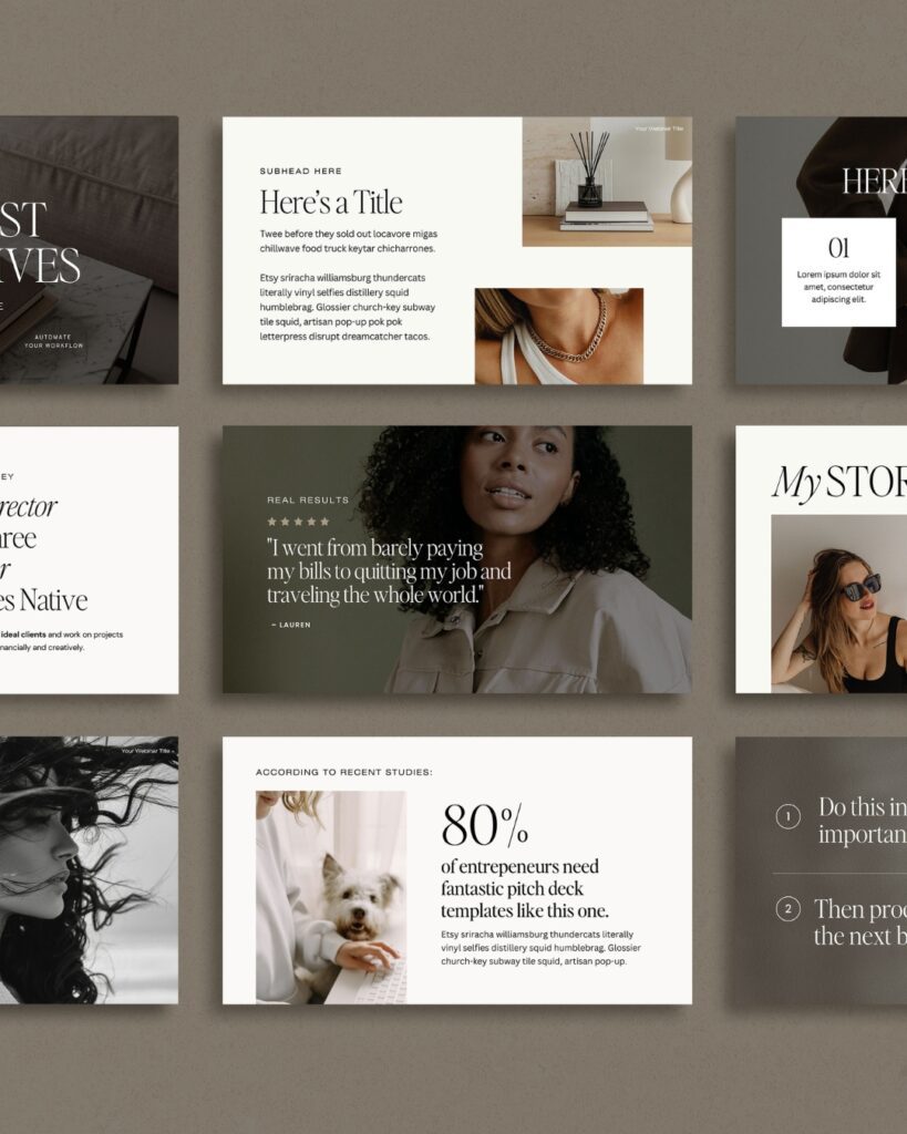
How do you create slides for a presentation?
There are tons of platforms you can use to create slides for your presentations, but if I’m being honest, there’s only one platform that’ll actually make creating them EASILY — while also ensuring they look BEAUTIFUL — and that’s Canva.
Now, I know what you’re thinking:
“But Jen… have you heard of PowerPoint? You know that’s like THE slide making go-to for presentations, right?!”
And, yeah, sure, it WAS … when I was in high school.
Here in 2023, though, Canva is lightyears ahead of platforms like PowerPoint and Google Slides, because it has a ridiculous amount of capabilities — and they’re displayed in a way that doesn’t feel overwhelming.
Wait, so… are Canva presentations better than other presentations?
Don’t tell Microsoft and Google I said this, but… YES.
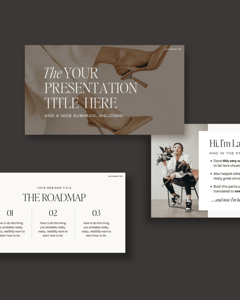
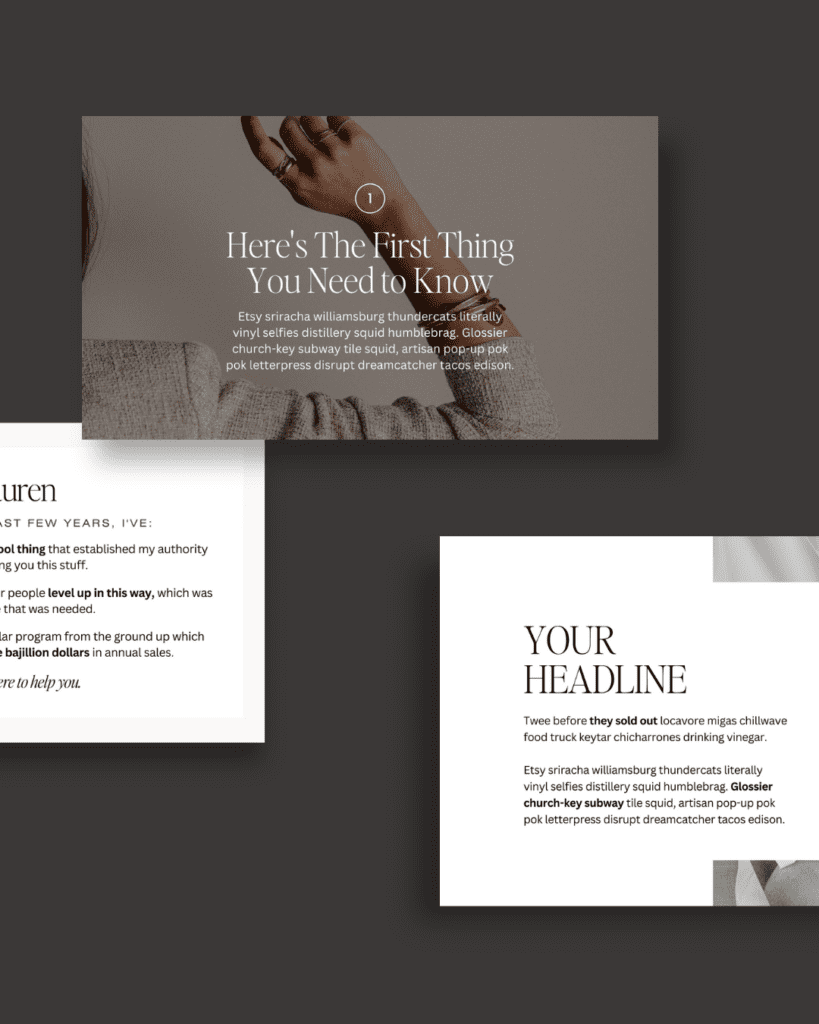
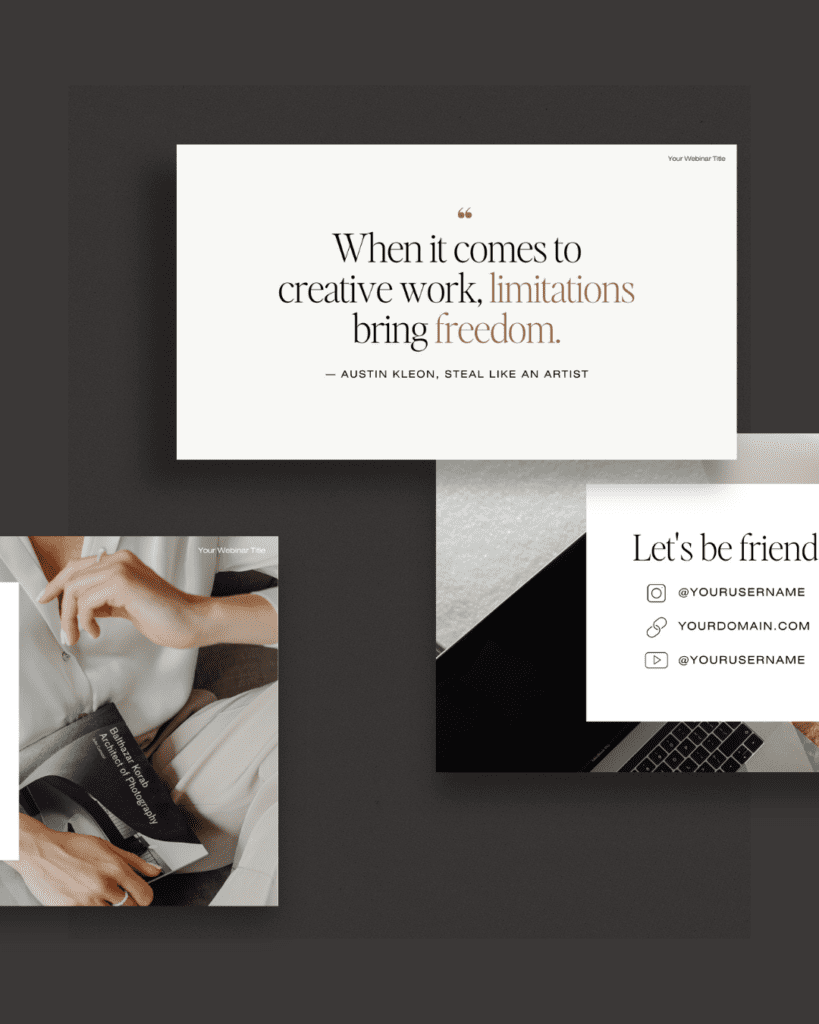
It’s why we chose to create our Webinar + Sales Funnel Canva Slide Deck and our Speaking + Presentation Canva Slide Deck on Canva — our entire brand is based on the foundation of being obsessed with giving you the best of the best, so when it came to creating templates for you to make presentations with, we knew we had to choose the platform that’d make the process as seamless as possible for you.
Here are a few more reasons why we use (and LOVE) Canva for presentations:
⭐️ Canva is the most user-friendly option for designers of any skill level.
As in: you don’t have to be a designer in order to understand how to use it. Canva was made for creators of all kinds to use, and we find that it’s the simplest, most intuitive platform for designing and customizing anything.
⭐️ Canva has WAY more capabilities than any other presentation building platform (like Google Slides or PowerPoint).
While other presentation building options may be capable of helping you create a good presentation, they’re nowhere NEAR as beautiful.
A huge part of creating an engaging presentation (that people actually want to look at) is the design.
In addition to capturing the attention of your audience, great design also proves to them that you care about providing them value, and that you’ve put a lot of effort into your slides.
(Hint: the easiest way to look like you’ve put a TON of effort in, without actually spending a TON of time on the design = using a presentation template.)
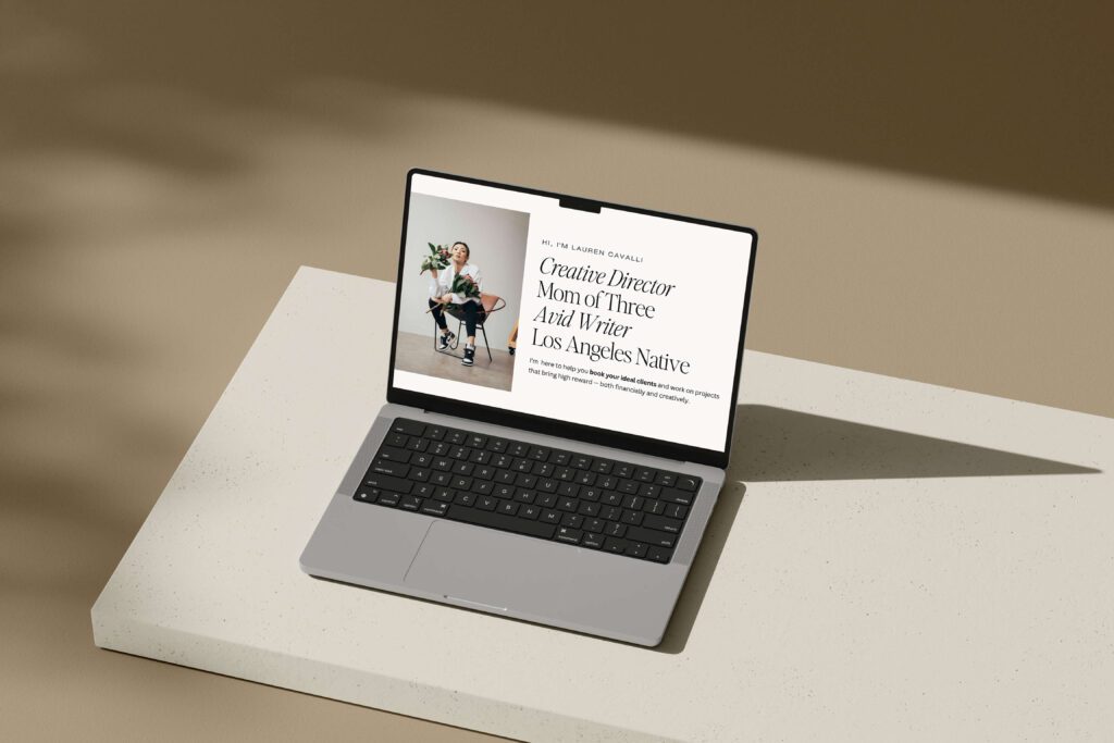
⭐️ Canva presentation templates are so easy to duplicate and use over and over again.
I’m not kidding when I tell you that we use our Canva slide decks for EVERYTHING, and everything we create somehow looks different.
Canva makes it SO easy to duplicate + reuse templates, saving you even more time.
⭐️ You don’t need to pay for Canva to use our templates.
Our Canva presentation templates work perfectly with the free version of Canva, because all of the fonts + photos have been pre-licensed for your use.
However, we do love having the Canva Pro membership, because when we’re designing other things, it gives us a lot more flexibility. Use this link to get one month free of your Pro membership!
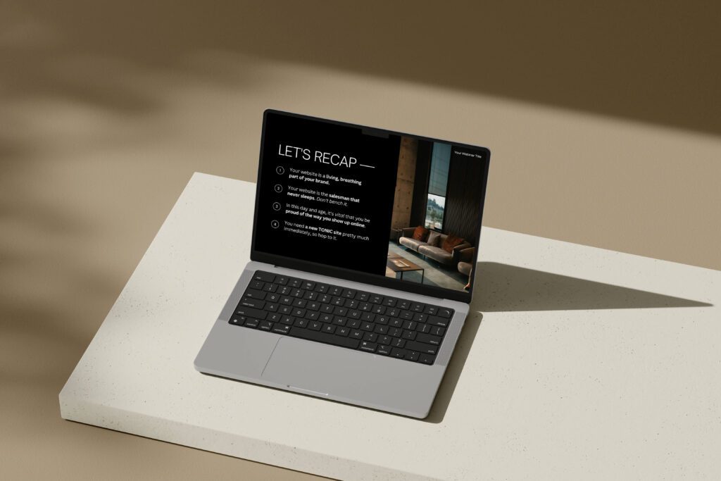
Want to learn how to take the next step toward giving the best presentation ever?
For expert tips about how to become a better public speaker and give great presentations, we recommend consulting the advice of our friend Mike — and we’ve taken the liberty of asking him every single question you’re already wondering about all things presentations.
>> Click here to read our interview with Mike about presentation + speaking tips!
For presentation slides that’ll ensure you’re able to effortlessly engage your audience EVERY time, check out our Webinar + Sales Funnel Canva Slide Deck and our Speaking + Presentation Canva Slide Deck.
Our TONIC regulars have been completely obsessed with customizing them for their presentations, but also for all kinds of different uses — and we can hardly blame them. They are pretty perfect.
>> Click here to read 9 ways to use our Canva presentation slide deck templates!
