When it comes to website design, it’s the typical approach to go all or nothing — first, a GIANT launch or rebrand with giveaways, iPad mockups, and Instagram confetti galore, then *crickets* until you feel like you’ve got bandwidth to tackle things again… or the PTSD subsides. Whichever happens first.
But we’re here to break that sad little cycle — and restore some confetti-level confidence in your website — with five simple things you can do to improve your online presence… right now! This list isn’t comprehensive and you don’t have to tackle it all at once, but we guarantee the sense of accomplishment as you move through the steps will feel GREAT and get you on your way to feeling red-dress-dance-emoji happy with the way you look online.
1. Review Your Website.
As we hit on above, one of the most common problems we see online is website neglect: a small business owner launches a new website, then doesn’t touch it (or even look at it) again until the sudden urge to rebrand strikes three years later.
But like great businesses, great websites aren’t just made: they evolve. They should grow, improve, and change to fit their owners, who are growing and changing, too.
So, if you haven’t really looked at your website lately, that’s a great place to start. To begin, open your website and browse every page with fresh eyes. Then, let’s evaluate:
- If your ideal client had your website open alongside 20 other tabs, would YOURS connect with them… and connect with them within the first .08 seconds? If so, great. Please proceed to question 3.
- But if not, why not? Does your site say anything or is it just inoffensively pretty? Does it show you at your best and what you do best? Does it set you apart? Does it make the user feel confident you can help them achieve what they need or solve a problem for them? Can it do any of those things better?
- Are there simple changes you can make to your images or copy to provide better points of connection with your ideal client? Can you add a little bit of your unique value proposition (UVA) to your about page, or showcase images that feel more like you and the work you love to produce?
- If you landed on your website for the first time as a client, not as someone who’s been there before, would you understand, number one, what you do and for whom… and number two, how to navigate through the site content? Does your site flow from one place to the next, with clear direction, or are you providing too many things to do and places to go at once? Or does each page feel like a dead end, without any steps forward?
- Related to #4: are you missing the calls to action (CTA)? No matter how pretty your site is, it’s really supposed to be a tool. Its purpose is to generate interest in you, your work, and your services… interest that compels clients to contact you. The best way to do this is by inviting them to do so! Add a note at the bottom of your portfolio page compelling them to get in touch about their date. Add a button under “Reviews” (your best social proof) letting them know you’re accepting bookings for 2020. Don’t leave it up to them to reach out — extend the offer yourself!
Bonus: Expand your scope. Ask a partner, friend, peer or all three to evaluate your site and brand, too.
Grab our Free BRAND INTERVIEW worksheet here for them to fill out!
2. Update your galleries.
Sure, you’re sitting on batches of beautiful images from last season’s work, but it’s easy to feel overwhelmed by the task of culling them all (“I’ll have time in the offseason!” you tell yourself for the 10000000th time) or like you should wait until you have a new website you love to showcase the work you love.
But while that unicorn-perfect next website is always out there, even a mediocre website with a portfolio laser-targeted to your ideal client is a HUGE improvement over what you have now. If you can add even 10 images that “show you what you want to shoot” to your site (or what you want to “sell” if you’re not a photographer), it’ll totally be worth that half-hour of your time! Remember, one of those shots might be the one that wins over that perfect client browsing your site! Updating the “hero images” — the biggest, most visible photos on your website — and putting new work you love in your portfolio/galleries is absolutely the fastest way to attract the clients you want and glow-up your entire website.
(Pro-tip: If you’re struggling over which photos to add, look back at the photos you’ve Instagrammed over the last few months. Chances are, if it made your feed, it should make your site!)
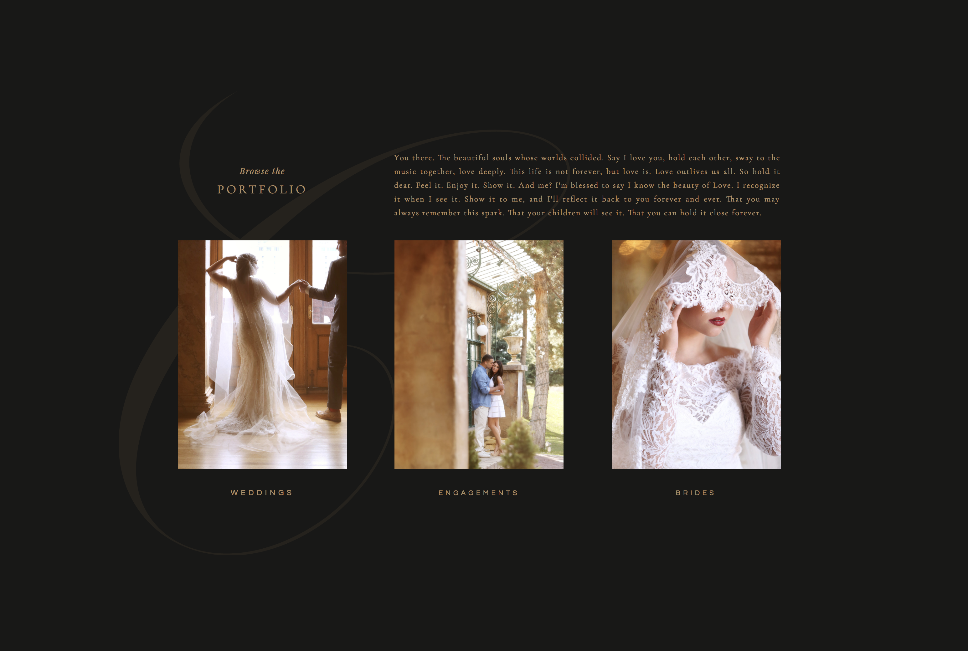
Exhibit A: Camilla Binks‘ version of Negroni features a thoughtfully curated batch of images from her most recent, on-brand shoots and immediately showcases what she does best and attracts the brides she’s after. The result feels cohesive and unmistakably “her.”
3. Refresh your about section images.
This is one of the easiest ways to make your website feel current, but ironically, the one photographers can be the WORST about avoiding! (Hello, images of you four hairstyles and three kids ago!) You, over there, reading this right now… don’t wait until you’ve lost five pounds. You look great. Hire someone talented to shoot some updated headshots and lifestyle images, considering in the process how you might make them feel the most like your brand (clothing, location, styling). Then pop those puppies up on social media + throughout your site. A new set of about images is like a mini-makeover – everything looks just a little more fresh with minimal effort.
Quick tip: while you’re shooting images of yourself, also think about styling a more “lifestyle” oriented image set that feel true to your brand — you’ll be able to use them on social media, and you’ll be so glad you have them later!
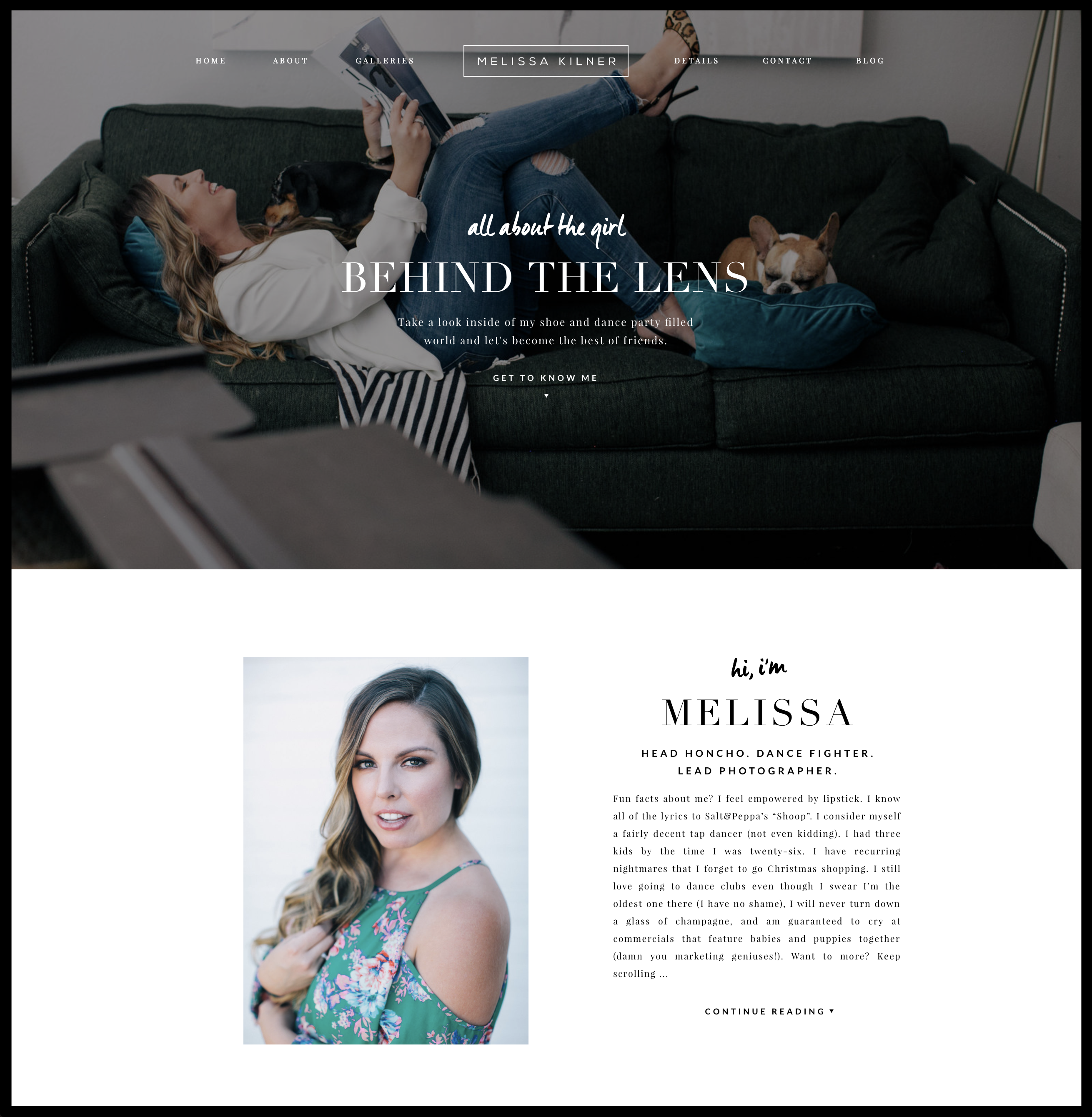
Exhibit B: Tonic Regular Melissa Kilner worked with our very own Jeff Shipley to create a new set of lifestyle images for her 2017 site update (psst… spoiler alert: the Amaretto Sour design is coming to the shop oh so soon!). They shot in her home, with her puppies, family and, of course, her collection of shoes as well as around her hometown, so the images have both a level of authenticity and her classic, chic signature style. Since they approached the shoot strategically and intentionally, the image set quickly elevated the look of her site and gave her tons of on-brand images of her and her lifestyle to share via social media throughout the rest of the year. Fresh, current and on-brand. Boom!
4. Get yourself some social proof (and show it better).
Updating your website doesn’t have to be a solo project. This is a GREAT time to ask for feedback from your friends, peers, and past clients. “I’m working on my website” is something most everyone understands.
But don’t just ask for feedback on your site (although it IS wise to ask what people like and don’t like about your site in step #1)… ask for reviews! One of the easiest ways to solicit testimonials is by explaining that you’re updating your website. Send a quick, personal email to a few of your favorite clients from the past year saying something like, “Hey there, ____! I’m updating my website and I’d looove to feature you. Would you be willing to send over answers to a couple of questions?” Then give them a few specific prompts. “What would you tell someone considering working with me?” is one of our faves!
Grab a few of the best quotes from those answers to highlight and add those to your site (preferably with an image attached!). Reviews are the BEST social proof that working with you is a great choice, and that solves a huge pain point for your potential client (who’s wondering if booking you is indeed a great choice).
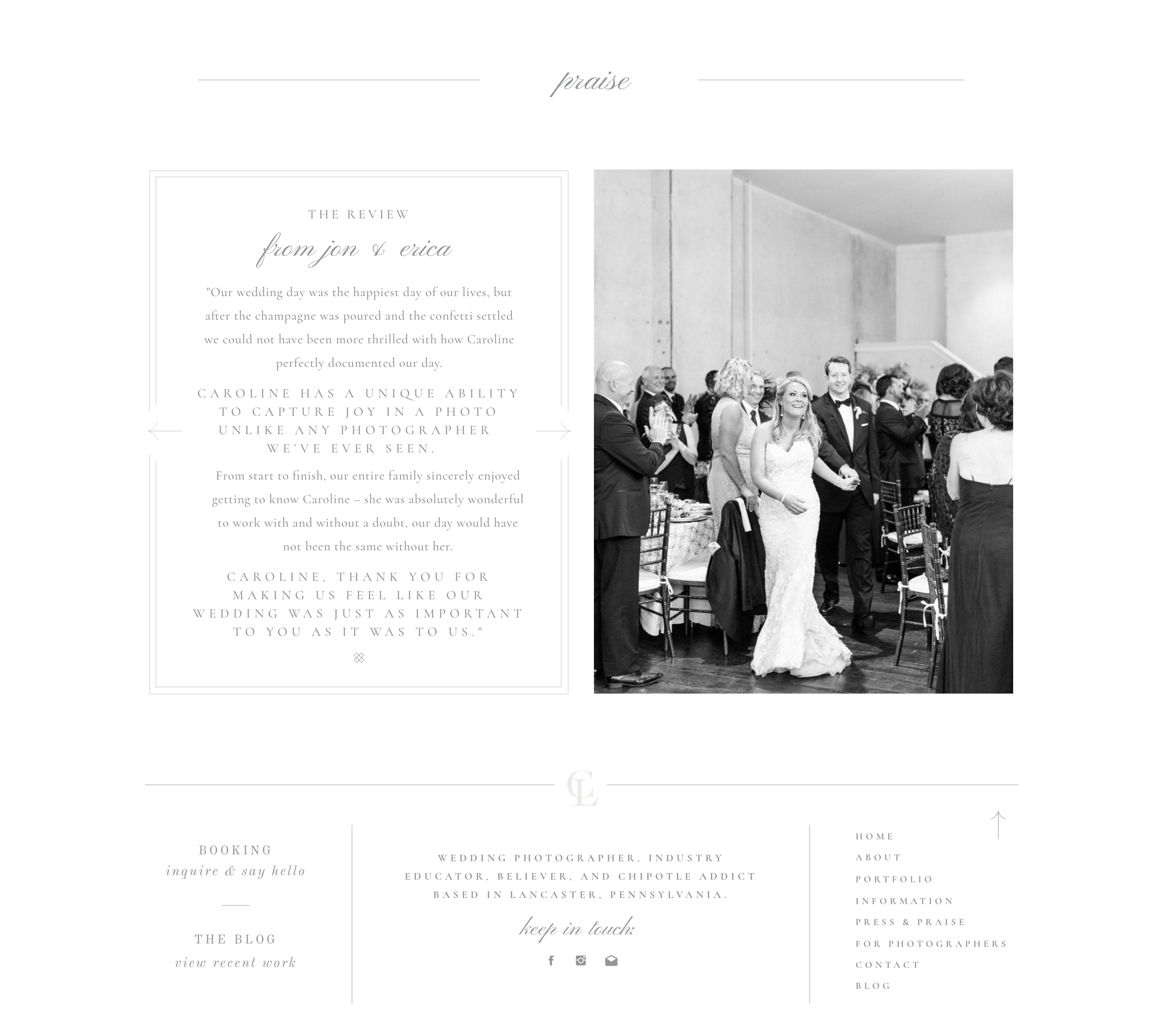
Exhibit C: Caroline Logan made use of the beautiful, ready-made reviews layout from our Charleston design to showcase kind words from her clients and even more signature images. This highlights what it’s like to work with her in THEIR own words. and there’s nothing sweeter than that when it comes to social proof. Can we get an “Amen”?!
5. If necessary, consider big changes.
We’ve shared a few ways to make your current site better, but what if after #1, you’re like, “Jen and Jeff, this is a ‘BURN IT DOWN’ situation?” Your site isn’t connecting with your ideal client, it doesn’t show you at your best, and it doesn’t set you apart in your field? Well, then it may be time to consider a new site design so you can book, accept referrals, and work with confidence in your online presence (instead of feeling embarrassed when someone says they’ve seen your website).
If you’re looking for a custom design, find a designer with a portfolio of sites you vibe with and inquire with them — they typically book up fast! Or if you’d like something beautiful up and running ASAP, we’ve designed some beautiful SHOWIT templates over at on our collection page that we don’t think you’ll want to burn down… *wink*
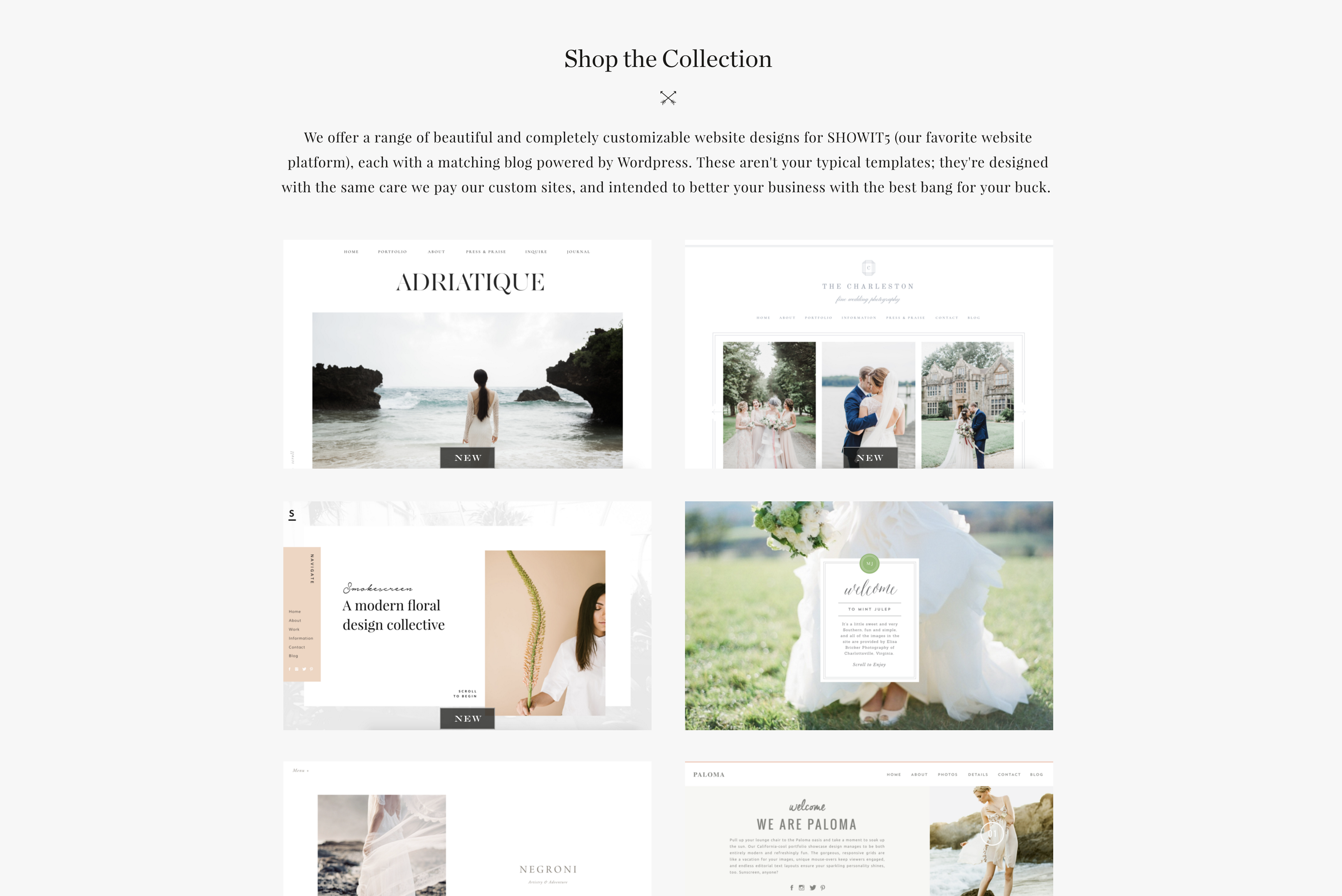
SHOP THE SITE COLLECTION
Either way, we hope you feel inspired to make a few micro changes that will leave you feeling macro-confident in the website you’re presenting online. We’ll pop the confetti (and the champagne) for you anytime.

