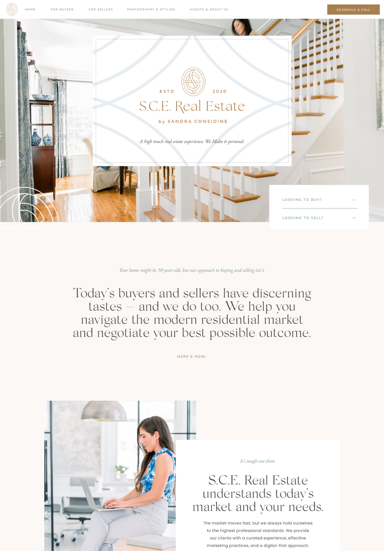
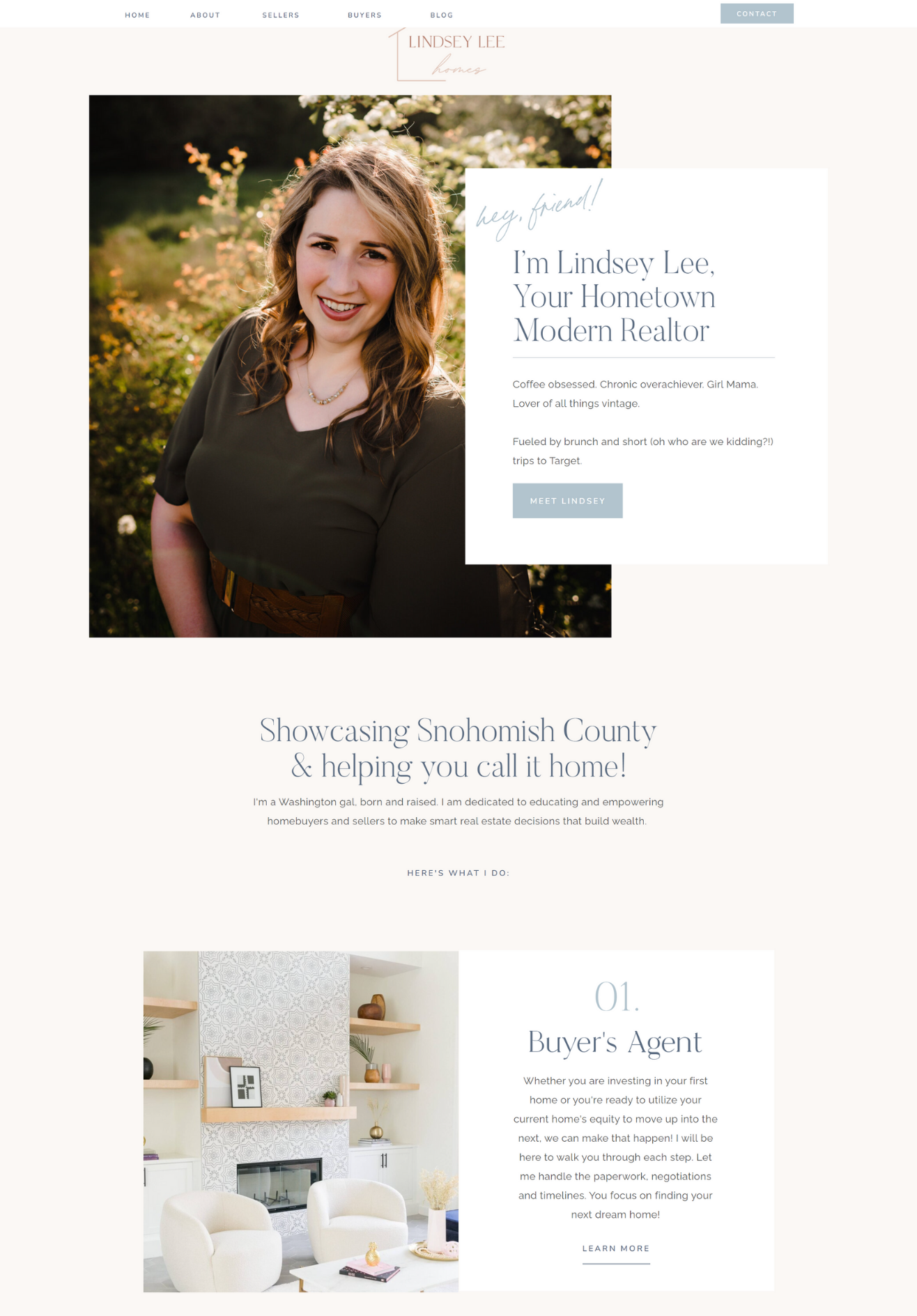
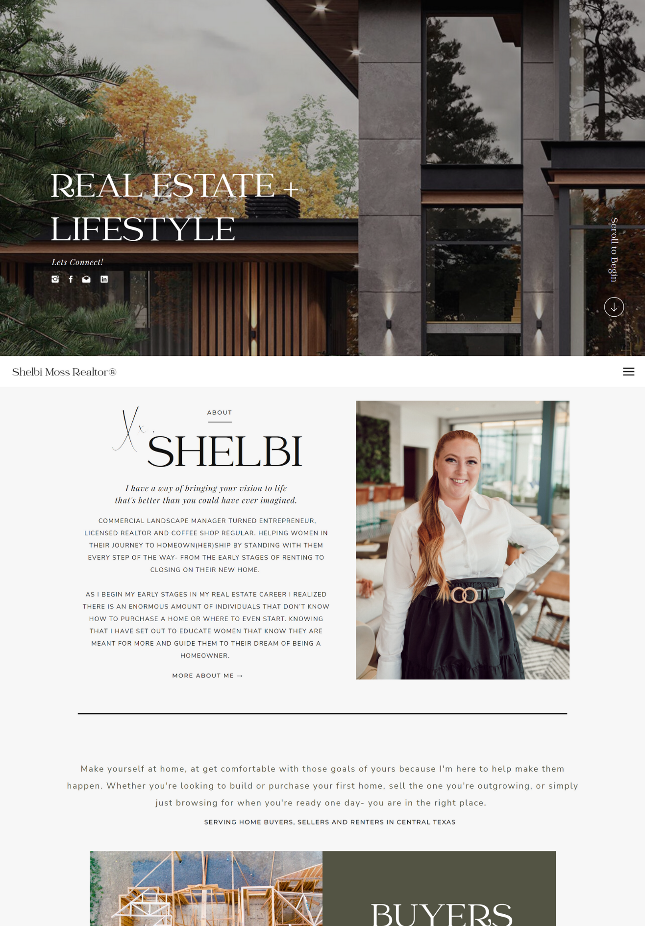
My mom has been a realtor for my whole life, so I don’t feel bad saying this:
Most real estate agent websites look like they’re circa 1995, and they somehow also cost a bajillion bucks.
If you’re a real estate professional reading this right now, you may think this is bad news, and that I’m dissing you. But it’s actually not, and I’m not dissing you; I’m helping you.
When your industry is populated with mostly not-so-great design, that means you have an OPPORTUNITY to instantly stand out with a first class, high-impact, professional, beautifully-designed AND strategic website that you *don’t* have to pay someone else thousands of dollars to maintain for you.
In other words, if everyone else’s website is baseline boring, that’s what your potential clients will be used to.
But when they land on your site—and you have actually taken the initiative to challenge the standard and produce something gorgeous—they’ll be so blown away that they’ll have no choice but to work with you.
A professional, strategically-designed website makes you practically irresistible.
So… how do you make it happen?! Of course, I’m going to spell it out for you. You already know I’m on your side. 😏 Keep reading for our best website tips for real estate agents & how our Showit website templates can help you impress clients and get results.

6 Must-Haves For Every Realtor’s Website
First things first, though—we need to make sure we’re on the same page about this: do you know what people are actually using realtors’ and real estate agents’ websites for?
Because it’s not searching for houses.
Nope—when people are searching for a home, they’re not thinking “let me check my local Realtor’s website” or “I wonder what this specific real estate agent has available right now”—instead, they’re heading to places like Zillow and Redfin to conduct their search.
Now, before you ask “okay, so… do realtors and real estate agents even NEED their own websites, then?!” – YES! They do. And here’s why:
When a potential client lands on your website, they’re looking to learn more about YOU, not your listings. Deciding which real estate professional to work with is an essential part of both the buying and selling processes, and your clients learning more about *you* is an integral part of that.
They want to understand your process, discover what it would be like to work with you, and learn more about the helpful real estate resources you have to offer. And your website is the perfect place to help them do that.
Here’s how to ensure the best real estate website in your market is yours: ⬇️
#1 – Make your readers feel at home by affirming that you understand their needs
Sorry, couldn’t help myself—the pun was too relevant.
As soon as your readers land on your site, they’re going to be wondering whether or not you’re worth staying and scrolling. If you don’t immediately give them a reason NOT to “X” out – they’ll be hitting that ‘back’ button faster than you can say sale.
The first thing all of your website viewers will want to know is: what’s in it for me?
Readers are inherently selfish—no matter what type of website they’re browsing—so cutting to the chase is extremely important when writing your website copy.
When you start off by speaking to the benefit you’re providing your clients, letting them know that you understand what they really want, they’re more likely to trust that you can be the person to give them whatever that is.
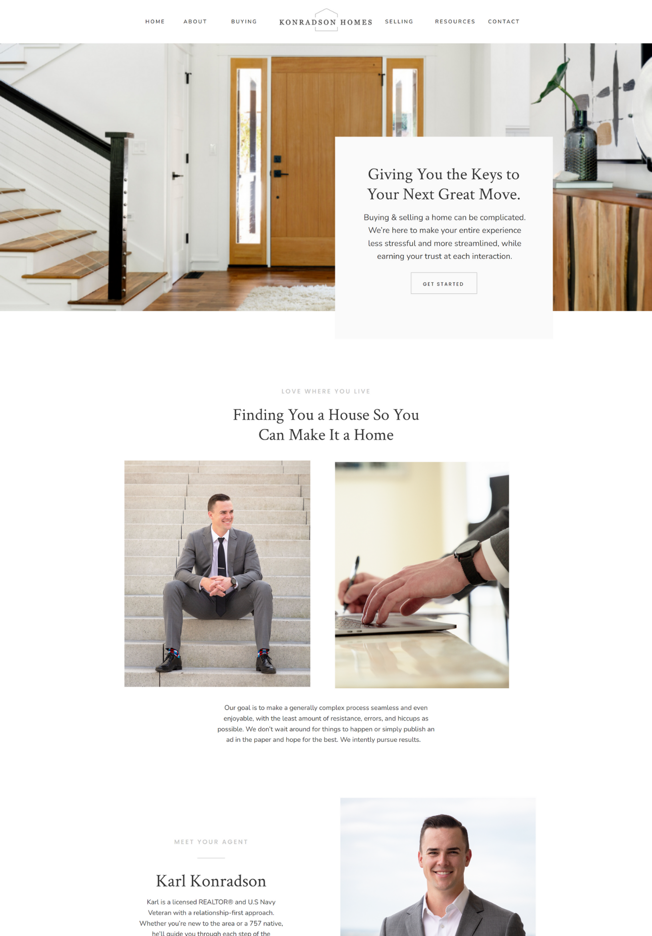
Take Realtor Karl Konradson, for example. The first thing his readers see when they click on his homepage is this:
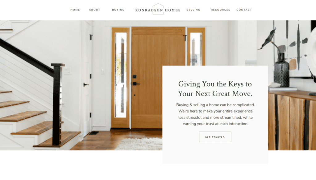
He empathizes with his readers by letting them know he understands what they’re going through (“buying and selling a home can be complicated”), how he plans on improving their current situation (“make your entire experience less stressful and more streamlined”), and how he plans on serving them (“earning your trust at each interaction”).
Karl then continues on to make what he does for his clients exponentially clear with this one simple sentence:

…and then following up with his goal / mission statement: “to make a generally complex process seamless and even enjoyable.”
He’s explaining to his readers, in very basic terms, exactly what they’ll get, how they’ll get it, and what type of experience they can expect in working with him. And his readers will appreciate the brevity.
Get rid of all the fluff, put yourself in your readers’ shoes, consider what they’re hoping to find in a great real estate professional, and tell them why that’s YOU.
#2 – Ensure your website is easy for your users to navigate
All great websites make user experience a top priority.
Here’s what I mean by that:
→ All the links work, the pictures load, and the copy is easy to see
→ Readers aren’t confused about how to find information they’re looking for
→ The design isn’t overwhelming or crowded
→ Mobile is optimized and structured for easy reading (side note: one of the endless reasons we love the Showit platform is the ability to completely customize your mobile site view independent of the desktop view!)
#3 – Use high-quality media and responsive design to impress your leads
The buying and selling processes are stressful enough—there’s no reason to add navigating a slow, mundane website to the list of things giving your leads a headache.
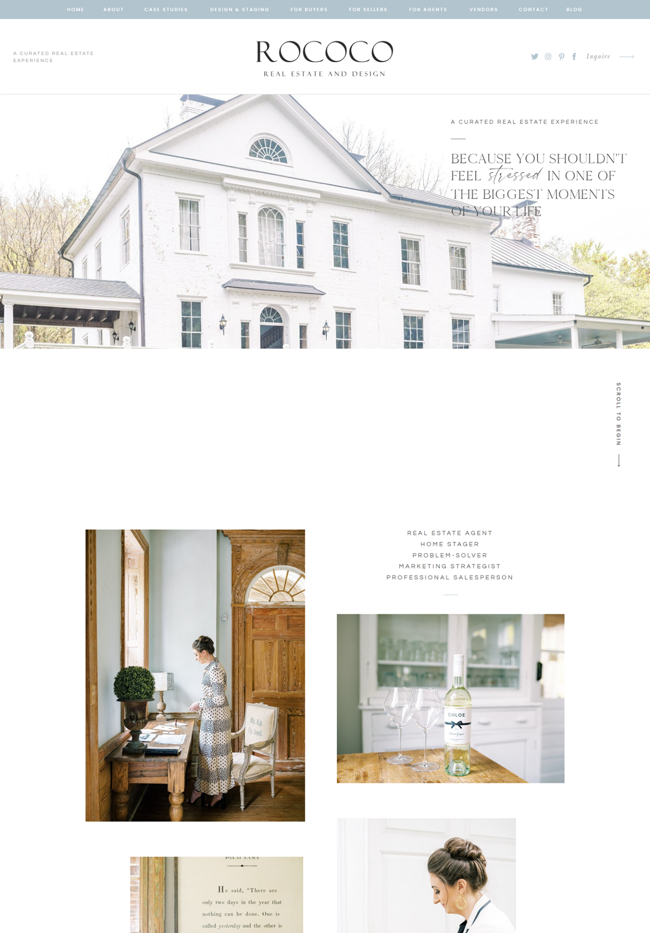
The more visually appealing your site is, the more time your potential clients will spend browsing it.
We love this example from Rococo real estate, who used our Clover Club website template to showcase all of her beautiful, bright images:
#4 – Optimize your website for SEO
No one can gush over your website if they can’t find it in the first place. Optimizing your website for SEO is essential for increasing your visibility online.
Learn more about how SEO works with the Showit platform right here!
#5 – Use your About page to build connections with your readers
Since you’re already familiar with Karl, let’s revisit his website to see how he uses our Gin & Tonic template’s robust About page to share more details about how he serves his clients.
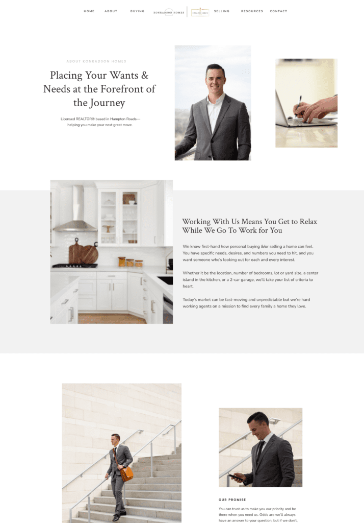
He kicks things off by explaining what he can do for you, why you need him, and what his promise is to you, before diving into the personal information he shares about himself and his life in Virginia Beach.
In putting his readers’ needs first, he’s showing them that he’s someone they can likely rely on, and he’s doing his part to garner their trust and interest prior to the “hi, I’m Karl, and here are all these details about my life!” part of his About page.
#6 – Show off how legit, credible, & trustworthy you are
When clients are looking to work with a real estate agent or Realtor, one of their #1 concerns is—as we just mentioned above—whether or not they can trust you.
And while having website copy that speaks to their current situation and shows you understand / care is great, some people need more reassurance than that.
They want to hear from other people how credible you are.
Or maybe they want to know which certifications you have, to see if you’re legit.
Or perhaps they’re curious if you’ve won any awards, or if you have access to any specific resources they can benefit from, or if you’re well-respected in your industry.
That’s where social proof comes in.
Implementing elements of social proof – aka proof that you’re as awesome as you say you are – is KEY to persuading leads to convert from reader into client.
Think about it: if you’re on the fence about investing in something, the first thing you’re gonna do in your “is this really worth it?” spiral is read the reviews or ask a friend their thoughts. Social proof—especially in the form of testimonials—is the website version of that.
Here’s an example of how Yasha of The Real Tea on Realty used our Margarita template to showcase her customers’ success stories:

Now, if you were Yasha’s ideal client, considering working with her, wouldn’t seeing those results make you about a million times more likely to invest? (It’s okay, you don’t have to respond—we know the answer is heck yes.)
Excited about the potential of a gorgeous new website? It’s easier to achieve than you think.
Here at TONIC, there’s nothing we love more than helping business owners elevate their online presence, and it’s clear that the average real estate website is… let’s just say, underwhelming.
But we know that the real estate professionals of the world deserve better, so we’ve created Showit website templates just for you that will…
✔️ Not only work for you, but help you thrive
✔️ Allow you to effortlessly integrate with IDX via a WordPress plugin
✔️ Are personality AND conversion-driven, so you instantly stand out to leads in a super crowded, unpredictable market
✔️ Give you the ability to control your OWN site so you can make changes and show off killer listings with ease
✔️ Guide you with copy prompts to articulate who you serve and what makes your agency team different, so you can get more of the clients and listings you actually want
✔️Are basically a cohesive brand in a box – all you have to do is add your images and copy and done! You’re back to closing deals 🤑
Join our email list to know exactly when these real estate templates drop!
Want to see our website templates for real estate agents in action? Check out our showcase!
