Ok, so maybe your website is pretty functional – I mean, hey, you have a website for your business or brand (and we think that deserves a trophy), but is it all that it could be? Is your website working for you? Is it attracting your dream clients? Is it making you money? Before you start sweating (don’t shut your laptop!), hear us out. We promise answering these questions doesn’t have to be scary (Whew!).
When it comes to website design, it’s the typical approach to go all or nothing — first, a GIANT launch or rebrand with giveaways, countdowns, and Instagram confetti galore, then *crickets* until you feel like you’ve got bandwidth to tackle things again… or the PTSD subsides. Whichever happens first.
But we’re here to break that sad little cycle — and restore some confetti-level confidence in your website — with 9 helpful questions that will actually help you figure out how to analyze AND improve your website. You ready?!

01 – Are You Excited to Send People to Your Site, or Do You Avoid It As Much as Possible? (The Cringe Test)
We totally get it. “Oh, my website? (*cringes*) You can just email me.” Maybe you aren’t happy with the way your website looks or functions and you haven’t had the time — or mental capacity — to make the updates or changes you know are necessary… Maybe your site feels out-of-date and you know you’ve got to do something about it, but that keeps getting pushed down to the endless to-do list. We’ve all been there. But if scrolling through your site makes you cringe, chances are it’s not going to excite the clients you dream about, either. We’re firm believers that you should be proud and excited to send people to your website – not just because it’s pretty and looks nice – but because you know when people hit that URL, they’re going to have a great, strategically designed experience with your brand that either ends in them wanting to work with you OR knowing they’re not the right fit.
If that’s not the case for you, then this is the NUMBER ONE tell you need a new website.
One of our TONIC clients recently told us she was so excited that she told the grocery store checkout guy about her new website launch, and THAT is the energy, we’re looking for, friends. That confidence translates from your site to every aspect of your business. And guess what — thanks to the advent of really, really awesome website templates (*cough), it’s very, very achievable without the headache and long hours you might think are involved.
02 – Can You Update Your Website and Make Small Changes — Heck, Even Big Changes — with Ease?
We don’t mean to be dramatic, but your answer to this simpy has to be a hell yes. The whole point of having your own website is that it should feel like yours in every sense. It needs to move as fast as you do. It should feel like a comfortable home base for your business where know where everything is, how to navigate and update, customize and personalize it yourself. Bonus points if that’s even FUN.
The great news is that this isn’t out of reach, no matter how technically un-saavy you may feel. Are you empowered and capable (and maybe even a little excited!) every time you jump in to make updates to your website? When you have a great marketing idea or a change to your business offerings, can you hop into your website and reflect that? If not, your website is going to lag behind while you innovate, and in today’s market, that simply can’t happen.
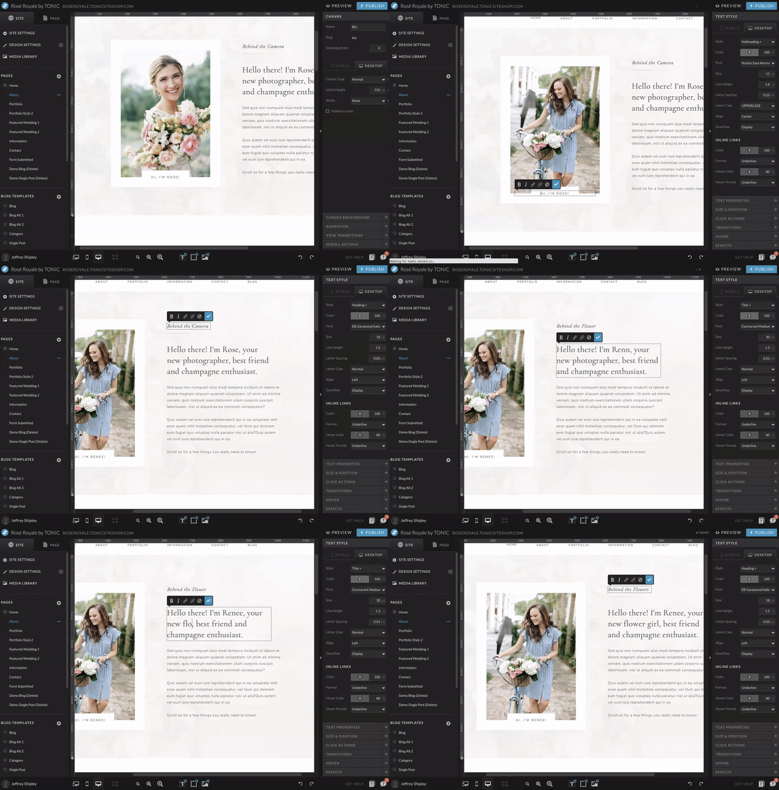
We design our sites to scale and change WITH you, instead of sitting static until you have time — and emotional bandwidth — for the next giant overhaul (which is never). We love hearing that our clients are adding the wedding they shot last weekend to their design or showcasing a new offering or changing their color schemes or doing some minor refreshes to make everything feel current. Like great brands, great websites aren’t just MADE; they evolve. Does yours need to evolve to show you at your best? Can you help it evolve, yourself? If not, we want you to shift into empowered and capable, like, yesterday. It’ll change your business game like nothing else.
03 – Is Your Website Performing Well, Analytically (And Do You Know How to Measure That)?
Are people spending significant time on your site browsing or are they jumping off right away? What’s your site traffic like? Are new leads coming in through Google as a result of your SEO, or is it crickets in that department? When do people bounce off your site? Is your mobile experience JUST as good, if not better, as your desktop one, or is it a little weird? How many people are actually hitting your portfolio or services page?
For many people, the answer to these questions is a) a vague sense of panic, and b) “no clue.” If you aren’t familiar with your website analytics and don’t know how to measure them, don’t worry, we’ve got another post coming up this week to help you understand the most important stats you need to measure and how to analyze them. When you understand analytics, they can provide insanely helpful cues to know when it’s time for an update and where your current site is falling short. (“OH, wait, 90% of mobile users leave after visiting my homepage? Hmm, I should probably add some stronger calls to action to other pages?”) For now, if you don’t have any way of measuring your site analytics or someone else holds the keys to that for you, that’s one more check in the “I might need a new site” column.
04 – Has Your Site Recently Been Updated to Reflect Your Current Offerings?
It’s a tale as old as time: we start out with a certain set of services, and then those evolve as we respond to customer demand and hone in on what we actually enjoy. But then life happens aaaaand we forget to update our website to reflect those changes. Maybe you’re a social media manager and you started out by focusing on ALL the platforms, but over time, you realized you provide the most value by being an expert with LinkedIn and Pinterest only… That’s great! Let’s just make sure your website copy/content reflects that change (so you aren’t getting inquiries from people who want you to manage their IG account). Or maybe you don’t even offer that course anymore, yet there it is, front and center on your website, or that “coming soon” section has been there for… well, too long.
Your website may no longer provide the kind of accurate information you need to showcase your current services really well, and that’s ok. We’re here to support you if you need to figure out how to shift things to better communicate — both visually and verbally — what you do and why you do it.
05 – Are Your Offerings And Benefits *Crystal Clear* To Potential Clients?
When a visitor hits your website, is it hit-you-in-the-face clear exactly who you are, what you offer, and why people should choose YOU out of a lineup?
Sometimes, because we’ve spent so much time on our own website, we start going crazy forget to see things from the perspective of our customers and dream clients. No matter where someone is looking on your website, they should be able to get a clear, cohesive message about what you offer in .08 seconds or less. You’ve heard that expression, “When you confuse, you lose,” right? That’s never been more true in this case, where if someone can’t tell what you can do for them quickly and clearly on your site, they’re going to close the tab and move onto the next option, stat.
That’s why ALL of our template have a clear, designated space of prime real estate on your website, first things first, that outlines and describes your offerings and benefits. Because most of all, people want to know how you can help them. If your site doesn’t accurately, simply, and clearly communicate your offerings and their value, this might be reason enough to find a website that allows you to showcase your offerings more effectively.
06 – Are The Inquiries Hitting Your Inbox One Dream Client After Another? (And, Um, Are Inquiries Hitting Your Inbox?)
In taking inventory of your current inbox, are your leads qualified or unqualified… are they consistently the people who make you go “YES, OMG, LET’S DO THIS,” or “Hmm, this doesn’t feel like the right fit.” If you are constantly on discovery calls with people who aren’t “your people,” then your website isn’t doing its job.
Your leads tell the story about how your brand is being positioned, and if you’re not getting the leads you want (or leads at all), it’s often a tell-tale sign that something on or about your website needs to be adjusted. The inquiries generated from your site should be the kind that make you OMG-excited to work with them, sans any “ugh” feelings 😒. To avoid the “ugh” feeling, your website and the content on it should ultimately disqualify leads that are not who you want to work with. We’ve got a whole guide about how your brand strategy supports this AND Our friend Kaitlyn shared a super helpful Instagram post about content positioning. If your leads are not really who you want to work with, it may be time to level up your site so you can connect with the right people.
07 – Is Your Website Set Up To Attract the Clients You Actually Want?
Our friend @ktmerry recently said something we found incredibly impactful:
“Don’t try to attract the client you have now; attract the client you want next year.”
So often, we forget to align our WEBSITE with our GOALS.
For example, we might tell our friends that our *goal* is to be the premier Italian destination wedding photographer. 💥 We’ve got it on our vision board, we’ve written it in our dream journal, we’ve bought a whole Amalfi Coast wardrobe…. but our website? Reflects our current reality, shooting weddings in the deep woods of North Dakota. 👀
If you want to be the premier Italian destination wedding photographer at some point in the near future, then right NOW, I need to see some freaking villas on your website, okay? (They don’t even have to be Italian!)
How do you do this? We need to see a paragraph on your about page about how and why Italy’s always inspired you, a blog post sharing your favorite Italy venues or your packing list for Lake Como, a section in your portfolio for that killer Amalfi Coast-inspired styled shoot.
We want you to find that one spot with the moss-covered fountain outside the second-best Italian restaurant in North Dakota and take a whole set of headshots there, okay? SHOW me what you want to sell me.
Why? Because the more clients see that content from you, the more likely they are to book you for their multi-day event in Italy, because they know you’re capable of shooting that for them…
You absolutely will not become associated with your goal unless the content on your website supports it. 💁🏼♀️
08 – Does Your Website Truly Reflect Your Brand + Demonstrate What You’re Capable Of?
Obviously, we know you’ve got something incredible to offer, but does your website really highlight all that you can do? Does your website limit you, fall short of capturing the best of your brand, or does it have a cohesive, aesthetic narrative that demonstrates how your business can do big, big things?
We love an Instagram meme just as much as the next person, and THIS ONE shows what so many creative entrepreneurs fall victim to: investing way too much time and energy in Instagram (or marketing in general!) and not enough time or energy into a website that showcases what you’re capable of — and honestly, why you’re the only one capable of doing it that way.

We’re proud of the fact that our designs don’t just show what you offer — they show what you offer, why you offer it, then feature a review, then have a “BOOK NOW” button directly below, capturing your dream clients at the moment they’re MOST excited to take action. They are designed to convert. Because otherwise, what’s the point? We think through the user journey of EVERY page to ensure that by the time they’ve browsed your site, they’ve been given the information that takes you from just another option in a sea of 47 open tabs (just me?) to the ONLY person they can imagine buying from, working with, or learning from.
If your website doesn’t do that for you — if it’s not reaching your dream clients and converting them along the way — it’s probably time for a change.
09 – Is Your Website Your “Closer?” (Can It Sell for You While You Sleep?)
This is what it’s all about, people! This is entire goal of your online presence. You shouldn’t feel like you have to handhold each and every client through the customer journey; your website should do that for you.
In fact, you should be hearing from customers consistently that your website made the process easy and enjoyable. You shouldn’t have to do all the work. If you are, maybe it’s not that you need to work harder. Maybe your website isn’t working hard enough. If it’s not reaching your dream clients and converting them along the way… if people aren’t coming to you from your site fully confident that YOU and YOUR product are the the best choice — it’s probably time for a change.
Take it from a few of our TONIC customers — a new site can make ALL the difference:
“It’s our ‘We’ve arrived!’ moment! Customers literally gasp when they see our site for the first time. We’ve had editors from NYT and Forbes on the site, and the professionalism of our website is helping me land meetings I wouldn’t have a shot at before. Update: Adweek is doing a story on us next week!” —Kathryn
“The results were almost instant. Our investment paid itself off within months and we began attracting our ideal client over and over again. The best part was the level of confidence our clients had in us before we even met with them because of how well our TONIC site told our brand story!” — Erica & Jon
“I have people book me without meeting me in person because they feel like they already knew me from my website. That speaks volumes.” —Ryan
“I often get compliments on my site but the biggest impact it’s had on my sales process is that people want ME before they even inquire. They’re confident and ready to move forward.” — Megan
“Inquiries have gone up since launching, even during this Corona economy! It feels like we moved into a brand new storefront for potential customers to peruse, relax, and feel right at home.“ — Jonathan
“When I revealed the new website I also released higher pricing, and nobody has batted an eye at it. I have gotten more inquiries from my website in the past month than I did in all of last year. I truly feel like that is thanks to my Tonic site!” — Jordan
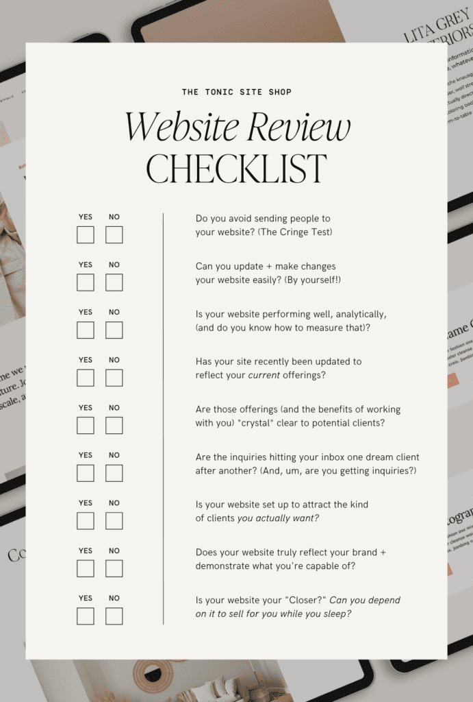
Here’s a visual checklist for ya:
Real Talk: Now What?
If – like so many people (you’re not alone) – you wish your answer to any of these questions was different, we hope it’s clear that we don’t want you to just cry over your laptop wishing things were better. You may be able to take these questions and identify some crucial and minor tweaks to make to your current site and voila!
But, and stick with us here, sometimes we just have to throw a funeral for the thing that no longer serves our business and move on. Our girl (we refer to her as such because we feel like real internet besties, even though she doesn’t know we exist), Tinx, has this theory that applies to dating but we think it also applies to websites. A stretch maybe? But here goes: if your website is no longer treating you well, has ghosted you of gaining qualified leads, or no longer aligns with where you want to take your business: it’s time to throw a funeral. We thank our current website for the good old times — and we look ahead to what’s next. In this case, a killer (see what we did there) website that checks all the boxes and replaces any doubt to the questions noted above with an undeniable YES.
If your website is no longer treating you well, has ghosted you (i.e. isn’t reaching your dream clients), or no longer aligns with where you want to take your business: it’s time to throw a funeral.
We think that momentum is key when running any business. And a new website can be the very thing that reignites your momentum (and don’t miss this part) — in the right direction. If you’re on the hunt for a momentum-starting website, browse our collection and be sure to sign up for our newsletter. Because you guessed it, we have new templates dropping very, very soon — and we want you to be the first to know.
If you want to get launch-ready with us and chat with a Site Stylist to help you land on the current (or about-to-drop!) design that’s best for the future of your business from our collection, email us!
We’d love to chat with you, understand your vision and goals, and help you land on the website design that’s fully equipped to accomplish everything on your vision board for your business. When your dream needs a website, we’re here to help.

