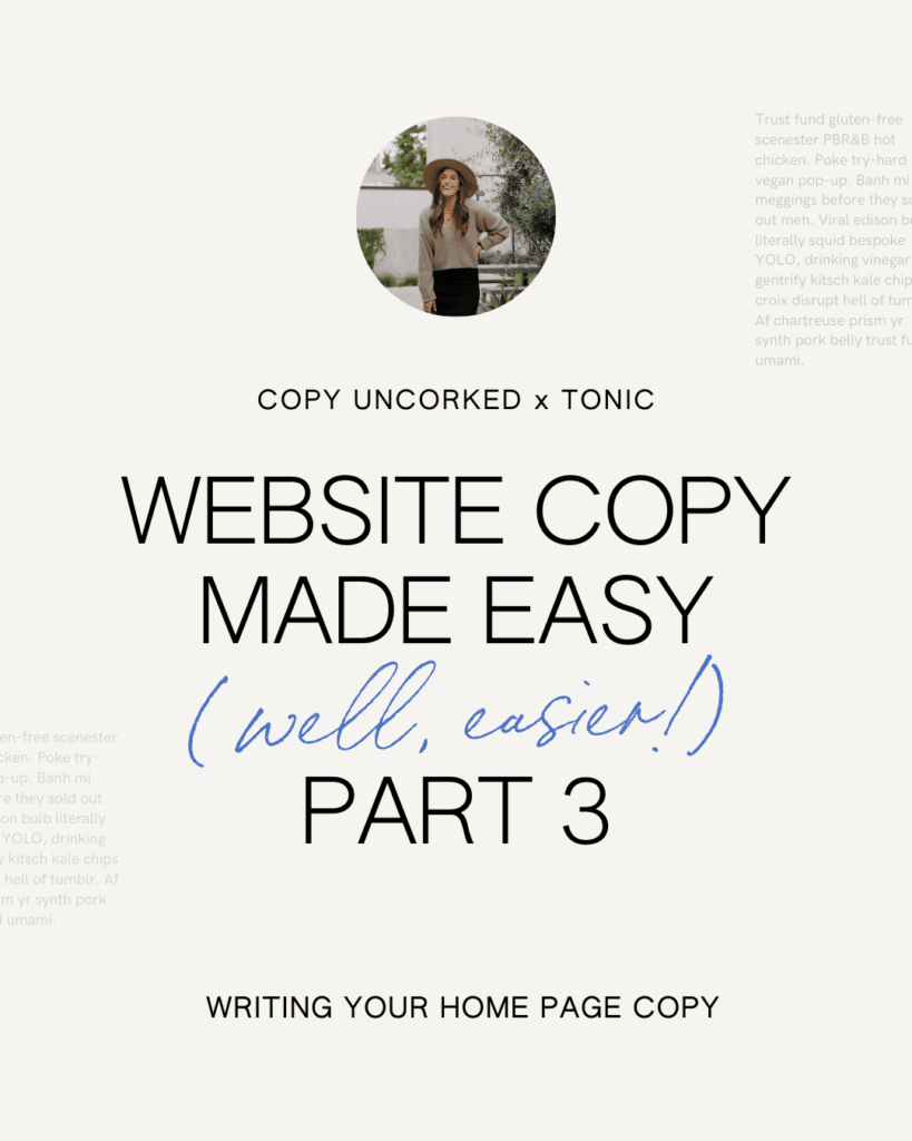
BY KAITLYN PARKER | COPY UNCORKED
Welcome to Part 3 of the Web Copy Made Easy (well, easier) Series. Who’s up for a dinner party!?
Go with me…
In Part 2, we compared creating your website to building a home – including establishing a great floor plan and a strong foundation – by way of a site map and a page-by-page outline.
Now, as you would while building a home, we’re moving on to the more detailed finishes so you feel wildly excited to host a great dinner party and welcome all your guests. (I mean, share your site with ideal prospects who become loyal clients/customers.)
So let’s talk about what happens the moment people show up at your doorstep and land on your home page. Aka the page that your primary domain links to and where most of your visitors will enter your site and navigate from. (i.e. tonicsiteshop.com)
…Which is why it’s so critical (and tricky) to get it right. Because while it may seem like a solid approach, your home page isn’t a place to simply throw everything on the wall and see what sticks.
It’s more like a stunning foyer that leads to an open floor plan, where guests can get a sense of where to go – without seeing everything that’s in each drawer, closet, and corner.
Basically, it’s where you make it *crystal* clear what you do, who you do it for, and how you do it – within about 5 seconds. Which is why we had you answer those questions in Part 2. 😏
Your no. 1 goal is to effectively communicate ^those three things, spark resonance, and move them one step forward at a time.
Because as Joanna Wiebe says, “the goal of every line of copy is to get your reader to read the next line of copy.”
SO—break out your site map & page outline, and let’s get to writing!
“The goal of every line of copy is to get your reader to read the next line of copy.”
– Joana Wiebe
01 – First up is your opening headline + description.
While you can absolutely rearrange the sections / canvases of your TONIC template (and/or our sample page outline from Part 2), the one you absolutely must keep is the opening headline statement.
You have to give ideal clients the language to understand the gap you fill &/or the impact you have on their life.
I get that you have a lot you want or could say. Distilling it down to just a few words ain’t easy! So here’s a couple tricks.
Forget the idea that your opening headline needs to be said in one sentence. Instead, embrace the concept of saying it through 3 statements.
Ever notice the beautiful font hierarchy on your TONIC template? Bet you have. Bet that’s also part reason you loved it so much. That’s intentional.
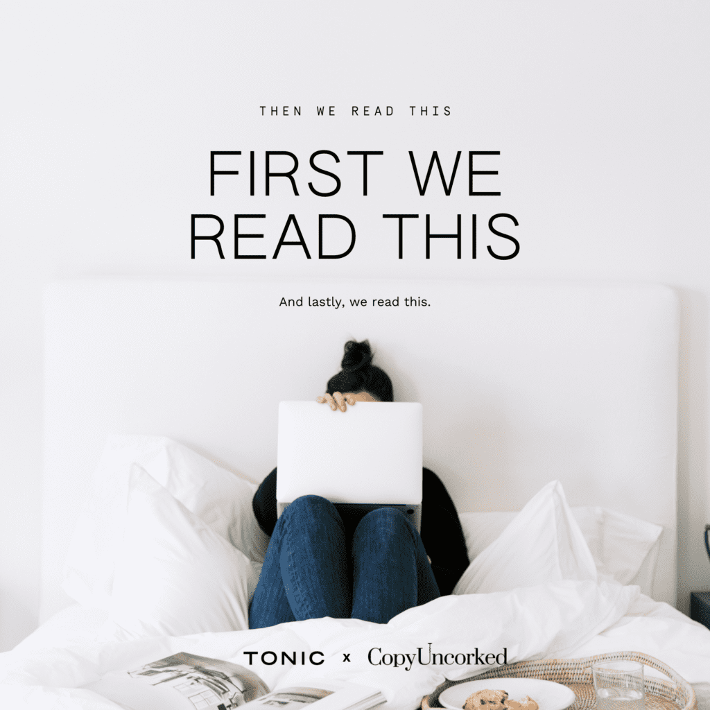
Here’s why: We don’t read copy the same way we read a novel. Copy tends to be choppy, skimmable, and punchy. We read it like this:
You can use that your advantage to pack more valuable information into less words, without feeling like you have to craft a massive run-on sentence in order to say what needs to be said.
SUBHEADER (CAN BE H1 IN SHOWIT) →
Use this for SEO keywords and specifics.
PRIMARY HEADLINE →
Use this for your catchy, attention-grabbing, connection-building statement that expresses your positioning & key messaging.
BODY DESCRIPTION →
Use this to make it tangible; sharing the how and the ultimate, desired end result.
Okay, let’s see this format in action…
SUBHEADER (CAN BE H1 IN SHOWIT) →
COMPLETE LAWN CARE FOR VIRGINIA BEACH HOME OWNERS
PRIMARY HEADLINE →
The grass around your house is about to be the greenest you’ve ever seen.
BODY DESCRIPTION →
Know the phrase the grass is greener where you water it? Of course you do. Well, that’s our job. We not only cut, edge, mulch, and weed your yard to perfection, we install a low-profile automatic sprinkle system that waters your grass while you sleep. Wake up, smile & inhale the satisfaction of having the greenest grass in the ‘hood.
CLEVER CALL TO VALUE →
SHOW ME THE GREEN
Now, this is just one formula. You don’t have to write it this way. And this faux company obviously has a rather tongue-in-cheek brand voice that’s not right for everyone.
So let’s look at another style—the simple one-liner statement, as seen in the Bijou template.
PRIMARY HEADLINE →
We are a full-service content-creation and social media marketing agency serving soulful creatives.
In this one statement, we get a feel for:
- A logical strength [full-servive]
- The what [content-creation and social media marketing agency]
- The who [soulful creatives]
This style can work great because it’s concise and incredibly clear. It also gives you room to further articulate the “how” – or aspects of your unique approach – in an explanatory paragraph “below-the-fold” (meaning, after the first scroll).
The best way to determine your own opening headline is to draft out a few options, landing on the one that says what you need it to, and does so in a way that evokes the right feeling from your reader.
Remember, this statement doesn’t have to say everything – so cut the extra adjectives and adverbs, and save those for some of the forthcoming sections of your home page.
Having too many words or headlines to work with is actually a good thing. Split them up and use them throughout!
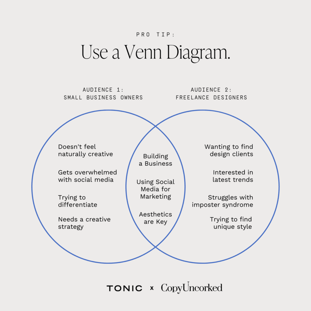
PRO TIP: Have multiple audience segments? Create a venn diagram. What’s the common core desire, perspective, or outcome that speaks to everything your company is about? That middle ground is what you can speak to in your opening headline.
02 – Embrace cohesion and some repetition, but avoid being repetitive.
Landing on a great value proposition can make you want to just repeat it all over every page.
After all, much of marketing is an exercise in repetition. Brands repeat themselves through advertisements and content creation in order to be recognized, memorized, and remembered by their audience.
BUT before you sound like a broken record throughout your web copy, remember great copy comes back to great communication. And if you’re not communicating anything new to your audience throughout each page, you’re missing an opportunity to further educate, inspire, and guide them toward the intended action.
“Great copy comes back to great communication.”
You will have some repeated bits of copy or duplicate sections throughout your site (those are known as a ‘Site Canvas’ in Showit)—like a lead generator or call-to-action canvas. But the majority of your copy should be different and dynamic, to keep the journey of discovery going.
So think:
- What hasn’t been said yet?
- What questions would an ideal prospect have from here?
- What’s their awareness/sophistication level when it comes to understanding what you offer?
If there’s low awareness, you may need to spend a bit more time talking about their problems & pain points (from a place of genuine empathy and connection, of course) in order to help them see what’s holding them back from a more ideal future. This also helps to create demand for your offerings.
If there’s a high level of awareness, you can speak more to the specific features of your product/service, appeal to their emotional side to foster a stronger connection, or put greater emphasis on the desired end result.
In either scenario, you want all of your copy to derive from key themes, beliefs, or messaging concepts so it feels cohesive, but not repetitive.
To build on the Bijou headline example above—and let’s say their ideal audience has a higher level of awareness, the explanatory paragraph below-the-fold could say something like:
Ever wish social media had a bit more soul to it? Us, too. Which is why we work closely with ambitious change-makers who want to create & publish content with purpose. With an intricate understanding of your brand’s values and mission, we speak to the heart of your people and grow your reach across multiple platforms.
See how the themes of ‘full-service’ and ‘soulful’ are subtly baked in? Same heart, same theme, different words to further articulate it all.
You can also see how this paragraph has:
- An attention grabbing question, while speaking to a primary desire/pain point
- A point of interest (“wanting to create & publish content with purpose”)
- A key emotional benefit (“an intricate understanding of your brand’s values and mission”)
- A motivating end result (“speak to the heart of your people and grow your reach across multiple platforms”)
Feel free to follow this loose formula when crafting your own!
03 – Intro’ing yourself on the home page? Keep it concise, compelling, and client-focused.
You’ll likely want to introduce yourself at some point on the page, particularly if you’re a personal brand, solopreneur, or primary service provider.
You only need a great photo of yourself and a small bit of copy to do so. But how on earth do you condense your entire life story into 4 to 5 lines?!
Well, you don’t. You highlight the parts that have made you uniquely qualified or equipped to serve your audience. This doesn’t just have to look like degrees or media features.
The benefit of doing your voice-of-customer research in Part 1, is that knowing your audience and expressing their needs back to them makes you look, sound, and feel equipped. (Obviously you’re doing this with integrity.)
So, save the fuller story for your About page and think of this section as a quick teaser.
Include:
- 1 or 2 logical strengths (background, certs, years of experience, number of clients served, name drop high-profile clients, data/numbers)
- A clear expression of your perspective &/or personality
- How that serves them and meets their core needs
- A simple CTA where they can learn more about you
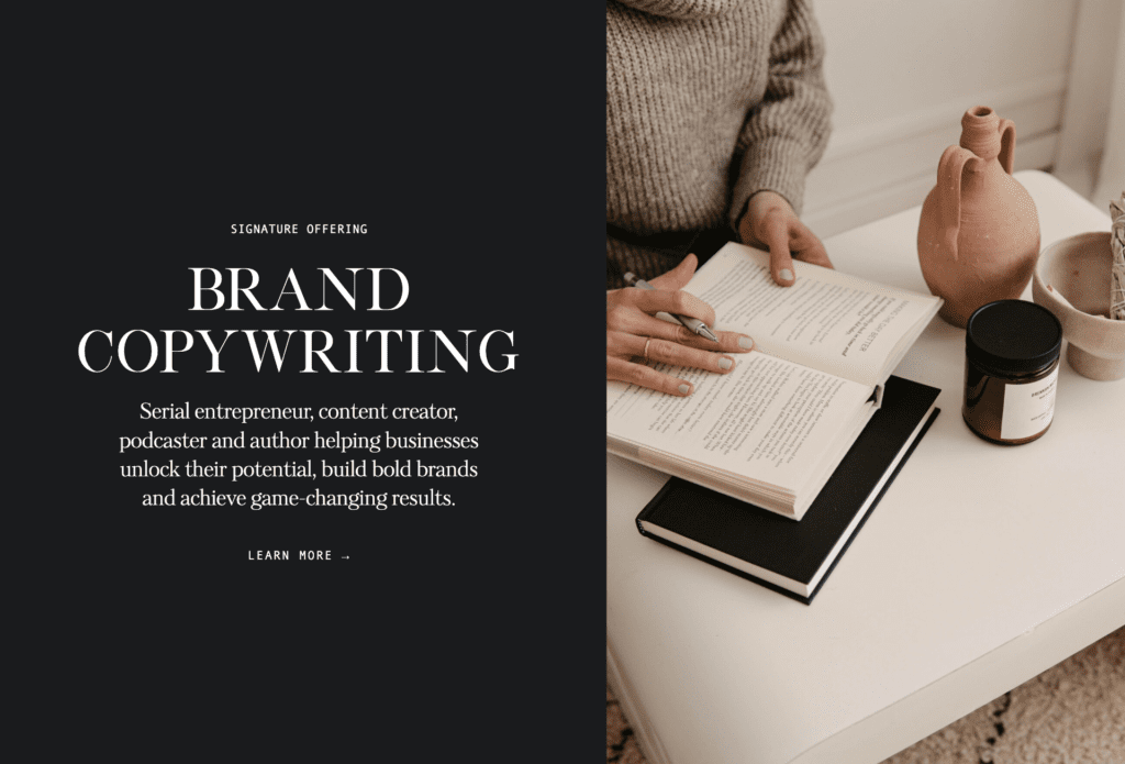
As an example, TONIC executed it perfectly here (no surprise!).
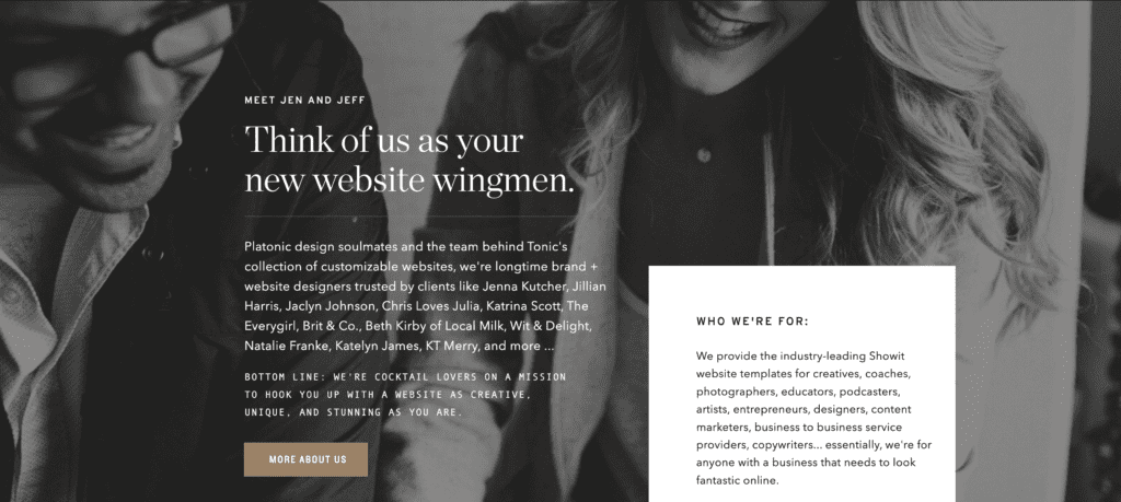
The headline is full of personality. The beginning paragraph builds authority & credibility. The final statement brings it back to their audience, making their reader the hero of the story. At right, they also reiterate ‘who’ exactly their reader is (aka you & me) and our core desire (looking fantastic online!).
04 – Showcase your offerings.
There are a few different ways to approach displaying your offerings on the home page. As mentioned, you don’t need to show every single offer from the home page, as that can lead to decision overwhelm and bouncing off the site.
Instead, you can think of:
- Categorizing your offerings into “buckets” (i.e. Tools, Courses, Services) and link out to pages that list it all out and provide more detail
- Highlighting the easiest, lowest cost way to get started (i.e. a digital product or mini-service)
- Showcasing your bread & butter services (i.e. Brand Design & Website Design)
- Choosing ~3 specific offers or packages to display (Membership, Group Program, 1:1 Coaching)
Depending on which makes the most sense for your business, I like to bring back the use of an “eyebrow” header within the font structure to explicitly state what it is, especially if it has a more creative or unique name. A line or two of paragraph copy below it is a great way to provide further context, especially for newer website visitors.
For Example:
MONTHLY MEMBERSHIP
The Rise & Shine Routine
Show up as the best CEO you can be, day-in and day-out
with this supportive online community of visionaries.
Because world-changing leadership starts with self.
[CTA] GET THE DETAILS
Why does that work?
- The eyebrow header gives clarity
- The header/name makes it branded & unique
- The description intrigues by saying who it’s for and why it matters
It provides juuust enough information to initially intrigue and qualify the reader, prompting them to head over to a page where they can learn more.
Three total offerings is a great rule of thumb in terms of how many to showcase, but it’s not a hard and fast rule. Our brains definitely like things in sets of three, but you could also change up the design in a section lower on the page to list out lower priority offers like: a Resources page, a Podcast page, a Blog page.
There are lots of different canvases within your TONIC template to choose from and play with in order to do so.
Focus on using the greatest ‘real estate’ to highlight what’s most important and what you want the reader to gravitate towards.
05 – WTF to say about your lead generator.
It’s 2022 – email marketing is arguably mandatory for online business owners. As time consuming as it can be, it’s truly a best practice to offer an incentive for collecting subscribers from the beginning.
I won’t go into different types of lead magnets or getting started with email marketing for our purposes here, but we do cover that in our masterclass bundle, The Tasting Room.
The good news is, your TONIC template has built-in, pre-designed lead magnet sections. So all you have to do is a say a few compelling words about it. Easy enough, right?!
Per usual, let’s break it down!
- What is it? (i.e. guide, audio clip, email series, checklist, free design files, etc.)
- What are a few things they’ll learn or gain from it – the more specific the better (i.e. learn the top 3 myths about ab workouts)
- What’s a tangible outcome (i.e. so you can learn the right ways to increase core strength and start seeing definition)
- [Optional] Include any relevant social proof
This could look like:
FREE!
Chisel Your Middle
This 10-page guide is your abs’ new BFF. You’ll learn the top 3 myths about ab workouts so you can learn the right ways to increase core strength and start seeing definition. Plus, you’ll receive more of our workout secrets that have helped thousands improve their fitness.
[EMAIL FORM] SEND IT TO MY INBOX
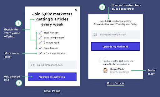
If your lead generator is currently more of a “newsletter”…let’s turn to Harry of Marketing Examples for this one, because he always provides, well…great examples.
Instead of saying “Subscribe to our newsletter” (yawnnnn) – make it enticing like this:
Okay, time for you to take action!
Above we covered the biggest and often hardest parts of your home page to write the copy for. The rest are typically sections like testimonials (make those skimmable with a headline!), work samples, latest blog posts, a closing CTA (see Part 2 for an example), etc. You can keep the copy for these sections pretty straightforward, or have fun with them and play into a theme if you have one. Just remember to balance the clever + cute ratio with subheaders and paragraph descriptions so nothing is lost in translation!
TAKE ACTION: Spend some time working through your home page copy, referencing to this blog post, your preliminary work + Site Map from Parts 1 & 2, and your TONIC template as you go.
Lastly, here are a few quick tips to keep in mind for your home page and all pages:
- Every section needs a headline to guide the eye and keep their attention throughout the site.
- Continue to get more specific as you move from the Home page to the About page to the Services page and to any individual product/services pages.
- Always end the page with a clear call-to-action, ensuring there are never any “dead-ends”. This helps to create an “open loop” and continue the journey throughout your site.
Part 4 will be up soon and it’ll cover an intro to writing the copy for your About & Services page.
To take your copywriting education to the next level, explore our collection of courses & guides, such as The Tasting Room, Vine to Voice, and The Copy House.
Cheers!
—
ABOUT THE AUTHOR

Kaitlyn Parker is the founder, lead copywriter, and wine enthusiast behind Copy Uncorked – a copywriting and brand strategy studio pouring up compelling words to help brands grow. Based in Virginia Beach, Virginia, Kaitlyn holds a Master’s in Strategic Communications and has worked with hundreds of clients worldwide in her 7+ years of industry experience. She’s also developed Copy Uncorked’s suite of signature courses—collectively known as CU Edu. Each program is designed to help newer creative entrepreneurs develop their brand messaging, write their own website copy, and more. When she’s not typing away behind a screen, she enjoys quality time with family & friends, where there’s usually a body of water, great food, and a glass of Cab involved. Connect with Kaitlyn on Instagram @copyuncorked or visit copyuncorked.com.