Meet The Luxury Copywriter! Maisie Prior is a UK-Based Copywriter changing the business trajectory of travel, beauty, jewelry, and lifestyle brands through the power of words. And her approach to copywriting means listening to a client’s vision and finding the words to make it happen.
When she discovered TONIC, she says it was the first website template “that I could envision complementing, rather than competing against my brand.” And we would have to argue to that *she* makes Gin and Tonic look (and sound) real, real good.

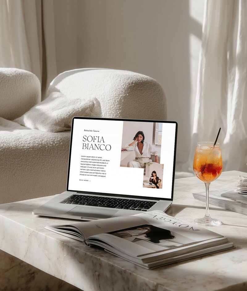
So *luxurious*, right? And what a beautiful customization of our Gin & Tonic Showit template.
How a TONIC website template positively impacted The Luxury Copywriter’s business
All aesthetics aside, the real transformation is how choosing and using a TONIC website template impacted her numbers.
I’ve had 75% more enquiries since going live – I can’t keep up!
She tells us, “I’ve had 75% more enquiries since going live – I can’t keep up! That’s not to mention countless invitations to collaborate with luxury hotel marketing managers, brand designers, photographers and fellow copywriters. I can’t believe it’s only been a short while since my launch and the success that’s already come from it. It’s done wonders for my confidence and how I present myself to the world as a credible business owner. I’m also really impressed with its SEO capabilities. I was expecting a little dip when I transferred my existing site over, but I’m thrilled to still be ranking at the top of Google for my targeted keywords.”
Wait. let’s unpack this.
Since updating her website to a TONIC template, The Luxury Copywriter has had:
- 75% more enquiries
- countless invitation to collaborate with dream clients
- Business confidence has skyrocketed
- Ranking in Google
Her story is why we stand behind our templates.
What Showit template did The Luxury Copywriter use?
The Gin & Tonic Showit template feels like it was made for Maisie because its minimal design means maximum impact.
I’ve always wanted to position The Luxury Copywriter as refined, understated luxury, and Gin and Tonic’s minimal, sleek and stylish design really matched that.
Simple and sleek, this design is proof of what can be done with a few, high-quality ingredients. It’s also PACKED with a statement homepage, a wow-worthy portfolio, a helpful resources page, and the kind of blog we all want to read.
Masie describes it so well (of course she does); “I also loved that it had lots of white space and didn’t look like a template. I’ve always wanted to position The Luxury Copywriter as refined, understated luxury, and Gin and Tonic’s minimal, sleek and stylish design really matched that.” Mission accomplished.
We’re in love with the way she utilized this Showit website template’s space:
- Her super curated images took our clean, minimal template to a more editorial, luxe vibe
- Check out how she utilized the Portfolio page here; see if you can’t scroll without wanting to travel to a luxury resort or sip mineral water. We dare you. She’s good.
- That services page, though. (You’re hired, Maisie.)
- Seeing so many recognizable brands throughout her site = instant trust that she has all the street cred.
And what’s really cool? The feedback she’s getting:
“A respected colleague in the luxury industry commented that they were drawn to 7 pages before leaving feedback for me – which is essentially the best compliment there is.”
We couldn’t agree more. Everyone wants potential clients to linger on their site (which is great for SEO by the way), wander beautiful pages like stunning rooms or gardens you find yourself in. And she says the Showit template design actually inspired her writing, which is music to our ears.
Her advice for those contemplating a TONIC template?
“DO IT. If you can even imagine it fitting with your brand and offerings (remembering that they’re fully customizable) you won’t look back.” – Maisie Prior
We’ll drink to that! So if you need a site that fits your brand like Gin & Tonic fits The Luxury Copywriter, click here to shop the collection.


