Summary
What do a doctor, an executive chef, a minimal beauty brand, and a college counselor have in common? Besides being, like, really cool careers, would you believe us if we told you they all used TONIC Showit website templates to create super professional, killer websites that totally represent them and their unique industries?
You might think our templates are just for creative entrepeneurs (photographers, coaches, artists, etc!), but honestly, if you’ll allow us this Oprah moment, TONIC templates are for everybody.

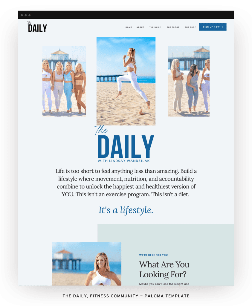
One of the best things about our Showit website templates is that they are versatile and flexible, which means they can adapt to vitually any industry. But don’t take our word for it — we’ve rounded up some businesses you might not expect to be using our designs and (bonus!) what they have to say about it. Scroll to the end for a whole slideshow of inspo, too (the fitness website! omg!).
The Doctor
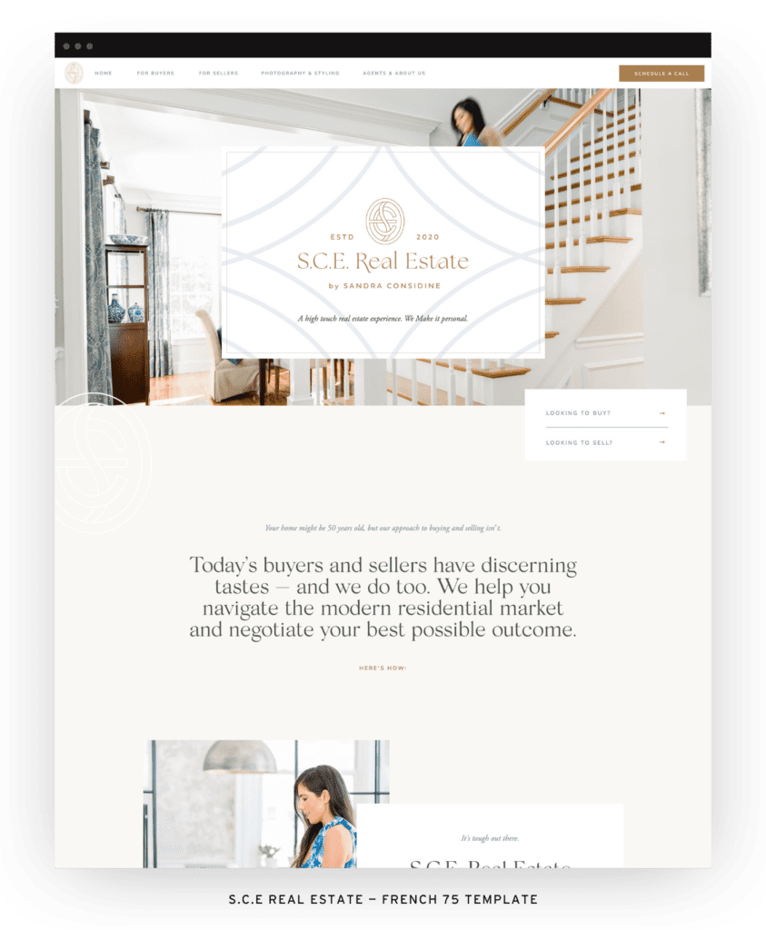
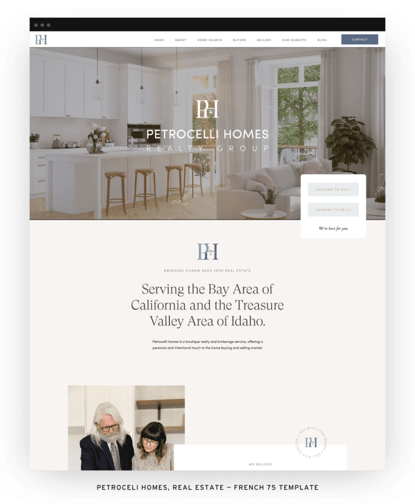
Just look at how Sonia of Juniper Primary Care used our French 75 template:
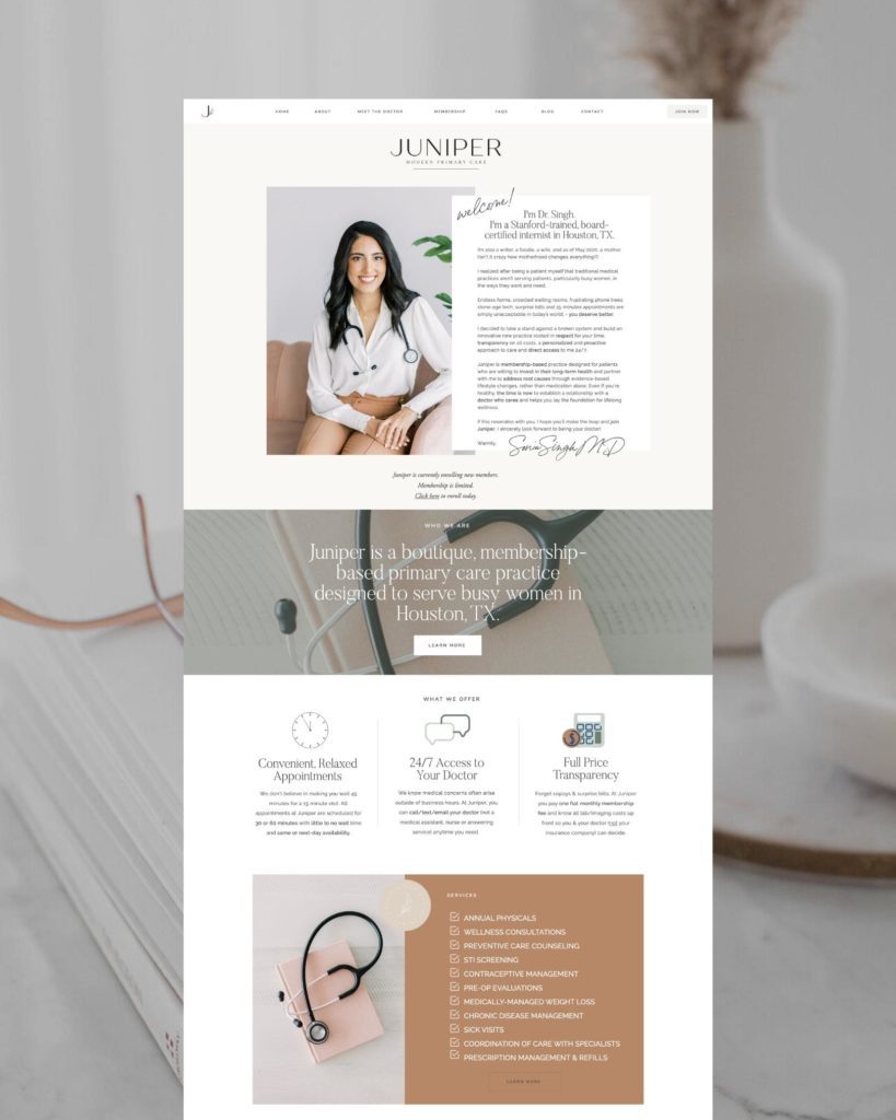
She told us:
“When I decided to launch my own medical practice in 2021, numerous people gave me the same advice: don’t waste money on your website. “No one looks at it anyway” was a common rationale for this. Everyone told me to just pick a cookie cutter template and get something up as soon as possible.
This never made sense to me. I always look at websites before I spend money on a product. A clean, user-friendly, thoughtfully designed is critical to making a small solo practice look legitimate, and more importantly, to give patients a sense of who I am.
When I found the Tonic Shop, the templates immediately stood out to me. They felt chic, modern and functional. Selecting a template was actually the hardest part. Once I had finally settled on one, I was surprised at how easy it was to integrate into ShowIt and customize!
The fact that a doctor with NO formal training in web design could create this site is a testament to the expertise and creativity of the team at Tonic.”
I have been SO happy with the final result and have been getting compliments on the site from patients and doctors ever since the launch. Within 1 month I had enrolled the number of patients I expected to have at 6 months with no paid advertising or SEO help.
Gosh, can you imagine the impact and impression a professional (and dare we say, chic) website gives Sonia as a primary care physician? The trust and credibility this builds? How much does she stand out in a sea of medical provider websites you land on (likely after hoping the ⭐⭐⭐ Google rating means you will be taken care of)? If only she could be our doctor!
The Chef
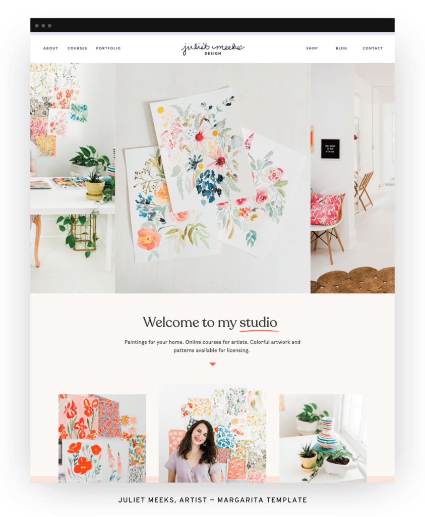
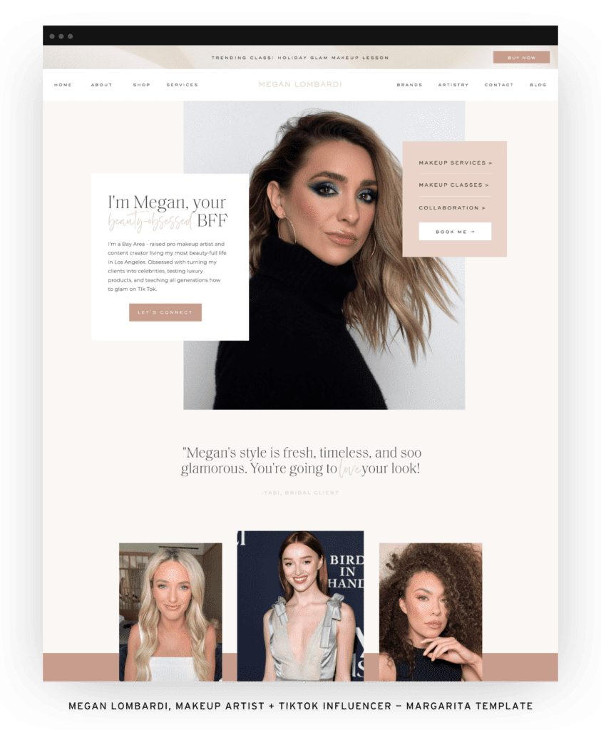
Executive chef Rafael Gonzalez used our Margarita Showit website template to showcase his culinary skills and offer virtual classes and a cooking club membership.
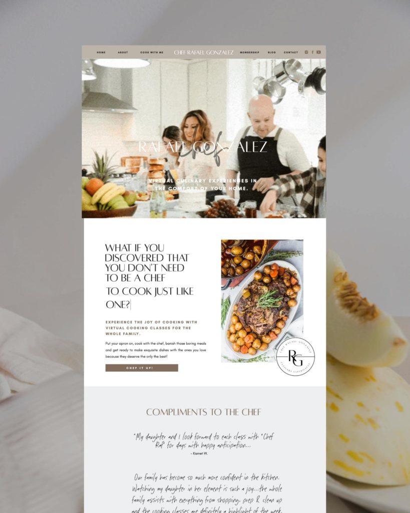
His wife (also his business partner and behind-the-scenes tech guru) told us:
“I’ve been lusting over Tonic Site Templates for a very long time so when we rebranded, it was without question I would switch to Showit and grab their templates. Their style reflected the modern, clean and elevated vibe we were looking for. Our old site was so dated, DIY and cringey, I always hesitated to drive traffic to it. Now, I feel like our prices reflect the quality of our product and our current and past customers have given us such high praise for it. With all the templates from Tonic that I have purchased, I feel confident in creating or adding any page to my website for our changing needs. Their templates are so easy to customize, it makes ME feel like a website designer.”
Now, I feel like our prices reflect the quality of our product and our current and past customers have given us such high praise for it.
The College Counselor
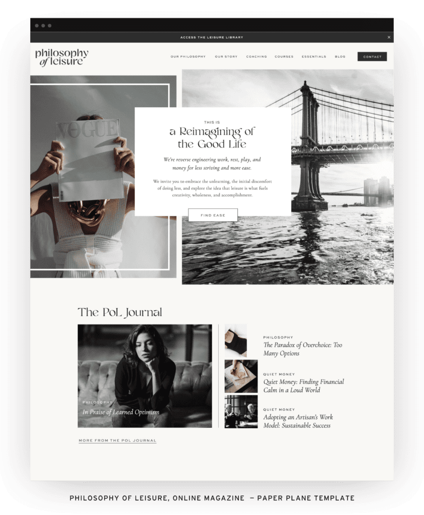
Brooklyn is a college counselor who put our Paper Plane Showit website template to work for her, creating a STUNNING site where students can learn more about what she offers and work with her to navigate the college application process. (Umm, where was she when we were doing this a “few” years ago?!).
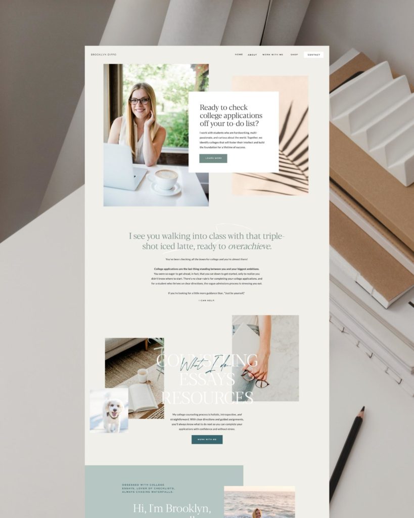
When we asked her a few questions about her TONIC experience, she said:
“I had been admiring TONIC sites from a distance for a while, wondering if I could possibly adapt a template made for photographers into a site that would work for a college counselor…I tried…When TONIC came out with the Paper Plane template, it was a no-brainer! It was fun, interactive, and optimized for the coaching industry and I knew it’d be quick to adapt for my college counseling business. I was right and my clients have absolutely loved it! My business has quadrupled since I put up my new TONIC site and the craziest part is that I’ve done less work on my website than ever before…My revenue is steady and predictable for the first time ever and I can sleep easy knowing that referrals will find their way to my site, get all of the information that they need, and convert into paying customers.
With TONIC, you get a template that is optimized for conversions and easy to use (who wouldn’t fall in love with that combo?) and you get the absolute best customer support in the market. They are serving up templates with a quality that makes you feel like a one-on-one web design client.”
My business has quadrupled since I put up my new TONIC site and the craziest part is that I’ve done less work on my website than ever before.
The Minimal Beauty Brand
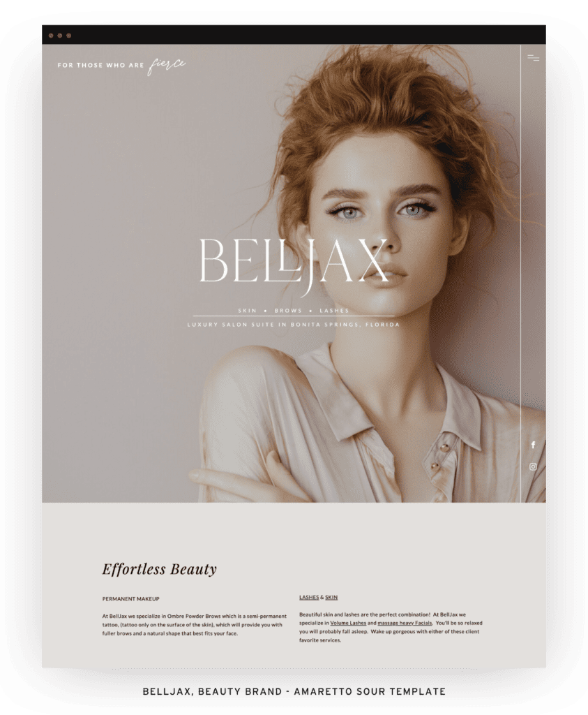
Jen of Minimal Beauty is a skin expert, face nourisher, and holistic mentor (sign.us.up) who took a TONIC website template and created an online space for her brand that does it all.
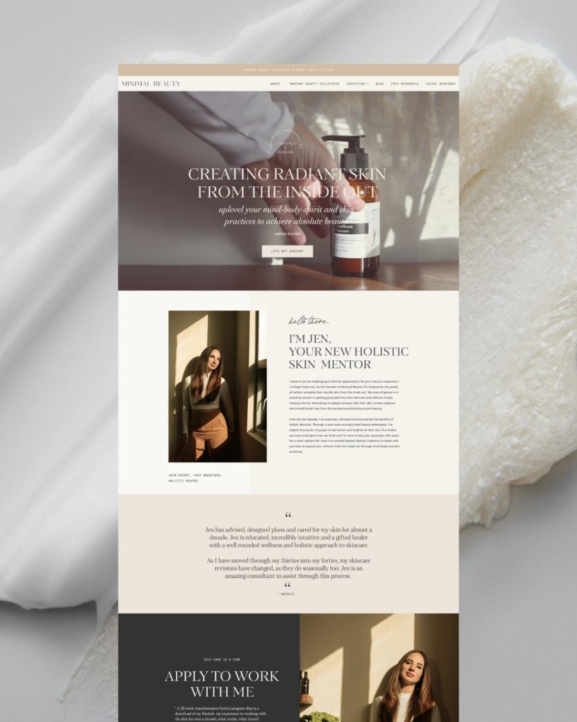
Almost as gorgeous as she is, her website is home to her new Radiant Beauty Collective as well as her blog and so many free resources. Here’s what she said about her TONIC experience:
“I am so happy with my Tonic template. It has up-leveled my site entirely and I know it will serve me for years to come. I love the customizations, which are endless, as well as the stunning and functional pages such as the favorites page, sales page, links page, etc that I have been able to use that are specialty TONIC creations. I get so many compliments and highly recommend TONIC to anyone ready to set their website apart 😊 “
Her site is just SO good. And talk about really setting herself apart; that’s something a great website can do, not only in oversaturated, creative fields, but in unique, niche markets as well.
I get so many compliments and highly recommend TONIC to anyone ready to uplevel and set their website apart.
The Wedding Website
Is this even real?! We can’t show you some of our favorite uses of our TONIC Showit website templates without showcasing this seriously incredible wedding website that branding and digital marketing expert Sarah Kay Love made for her *literal* fairytale of a wedding. Can you even imagine this wedding week in Italy?!
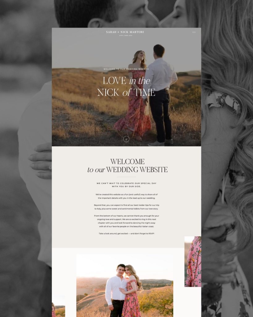
Sarah and her team created their “Love in the Nick of Time” website using pieces of a few of their TONIC templates and the result is pure ✨magic✨. We miiight have spent way too much time reading their entire love story because…research, and it’s better than a binge watch. We don’t regret it one bit. Sarah told us:
“As a former photo editor for The Knot Magazine, I feel like I had seen it all! As I went into designing my wedding website, I was very worried that it wasn’t going to feel special or unique to us as a couple because most wedding website platforms offer little template customization. I wanted our friends and family to really have an interactive experience with our love story and feel completely immersed in all the details that we have worked so hard on for the wedding week in Italy!
I knew right away that working on Showit to create our wedding website was going to make the most sense. Tonic Site shop has the most beautiful templates and felt so much more aligned with the vision that we wanted our loved ones to experience. I worked with my team to mix and match a few of our favorite templates and we were really inspired by a timeline concept (I think on the Clover Site?).
We took this and ran with it for our Love Story/About page! I hired Portrai.Me and Cecile’s Paper Co. who both created some gorgeous illustrations that really elevated the story of our meeting and the sequence of events for falling in love. Jose Villa came in for the win with our stunning engagement photos which are featured all around the site along with Miguel Garcia who created the videos. We couldn’t be more excited about how everything turned out and how unbelievably easy the process was thanks to TONIC!“
Um, yeah, we couldn’t be more excited, either. (Are we weirdly invested in this wedding now? MAYBE.) This will forever be one of the coolest ways someone has truly made our TONIC template(s!) their own.
…AND All the Others
We brag all the time about how customizable our website templates are, and while that’s incredibly true, we may not talk enough about how they are created with *literally* everyone in mind. We love seeing how people – in the creative world AND otherwise – have put our templates to work for them. If you want to charge premium prices and attract your dream clients, every outward and inward facing part of your brand needs to be “premium” and feel on-brand for that dream client. And that’s exactly what each of these incredible examples have done. We have to give them all the 👏👏👏 for creating such killer websites with our TONIC templates, and we are always, always designing with you (and all the brilliant things you are creating and doing) in mind.
We promise, there really is a TONIC template for whatever industry, event, business, brand, product, service, or dream you have. Want to read more about real TONIC client stories? Check out our Customer Showcase. What to see ALL of our Showit Website Templates? Shop the collection.
