One of the most challenging parts of managing your online presence is definitely curating the content for your website. We hear this over and over from new business owners to ten-year veterans, so we know the struggle is real. This week we’re digging into our tried and true ways to create content that connects and that will help you land your dream clients.
First up? Image Curation + Integration. If you’re the watching type check out the video below. Otherwise, read-on. Or if you’re an over-achiever like me and you want to be the teacher’s pet, read AND watch and I’ll give you a gold star.
You guys, this is kinda my favorite thing in the world because curation is so incredibly effective and can make the biggest difference in communicating your brand’s heart, soul, overall vibe, and most importantly in landing your dream clients. It’s crazy how powerful a thoughtfully curated image set can impact how your brand is perceived and can truly sell prospective buyers on hiring you!
So, how do you ensure your work is shown at its best? Curate. Curate. Curate.
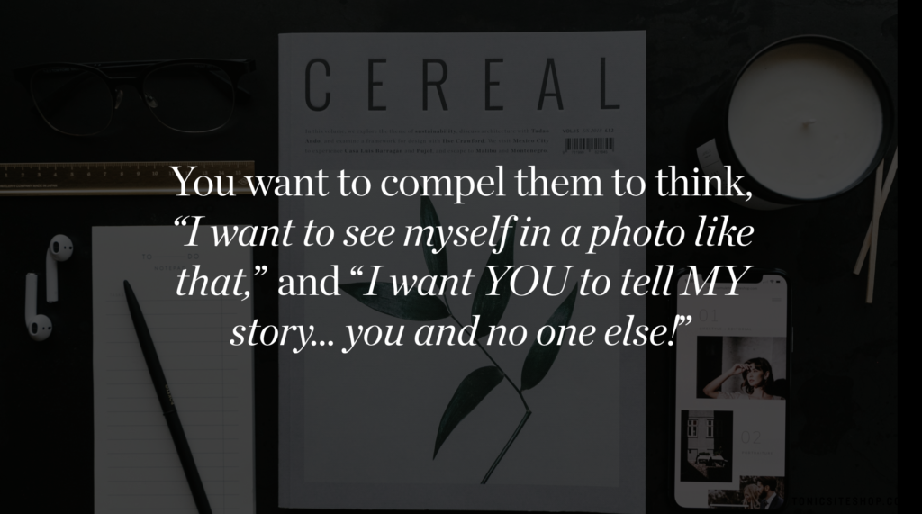
But here’s the thing, you have to be ruthless y’all. Don’t settle for decent work. Show your best. Curate with purpose. Don’t just put it in because it’s pretty but, rather, the images that are the most dynamic, most on brand and most compelling … because it says something to the person looking at it and compels them to think “I want to see myself in a photo like that” and “I want YOU to tell MY story … you and no one else!”
Here’s the fool-proof TONIC way to curate your work like a boss.
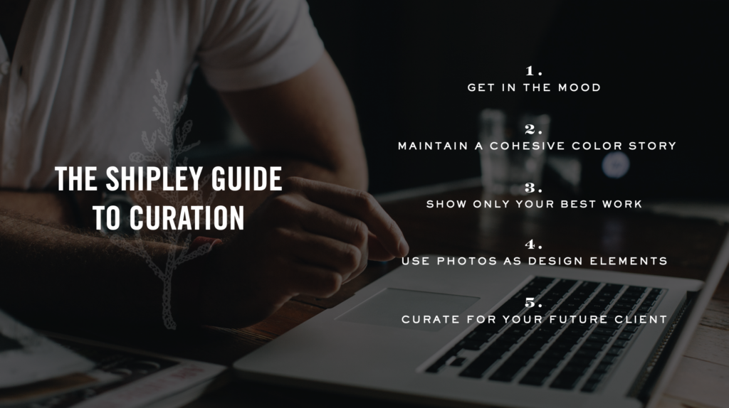
Image Curation 101:
- Firstly, I suggest you do this while you’re a) a wee bit tired or 2) moderately tipsy …. because you won’t overthink it and will be a bit ruthless. Want me to take a machete to your portfolio? Liquor me up, and it’ll be great fun. Sure it might sting a little bit but this isn’t about your feelings, honey. You’re awesome. Your work is awesome. That’s not in question here. It’s just about finding the best, so that your dream client can actually see it.
- Pay attention to a color story and make sure it’s cohesive and that the tones are consistent and complementary to your design.
- Less is more people. Don’t worry so much about showing a look-at-everything-I’ve-ever-created-in-my-whole-life range, but rather show only the best, most iconic work. Nothing more, nothing less.
- Remember that not every photo needs to be full-screen and in your face. Sometimes your work can be used as a graphic element purely for aesthetics or to create a specific mood or vibe. A little white space goes a long way, people. Trust!
- Curate for the client you want in the future, because you get what you show. So, if you want a classic bride, show classic brides, in classic settings, wearing classic things. Don’t show a bride running through a field of wildflowers wearing a flower crown and twirling about like Anne Shirley, ok?
I’m sure you’re wondering: what does this look like played out in real life? Take this for example…
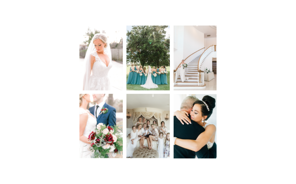
Magdalena. She determined that her ideal client was a laid-back, jet-setting couple with elevated taste and global sensibilities. Therefore her site should feel chic, kinda sexy, young, adventurous with boho and fine art undertones throughout. When Magi sent me a heap of her work and it came time to curate it for her site and then position her strongest, most iconic imagery in the most effective places possible — I knew what we we’re looking for, what was perfect, and what was meh, because of the rubric we had clearly pre-defined and I knew what the images needed to do.
So here’s what some of her gorgeous work would look like positioned without this strategy and thoughtfulness and without her ideal client in mind… (which is pretty of course but not as effective as possible). It’s just a little too classic… a little too, “hello tiara!”
And then…
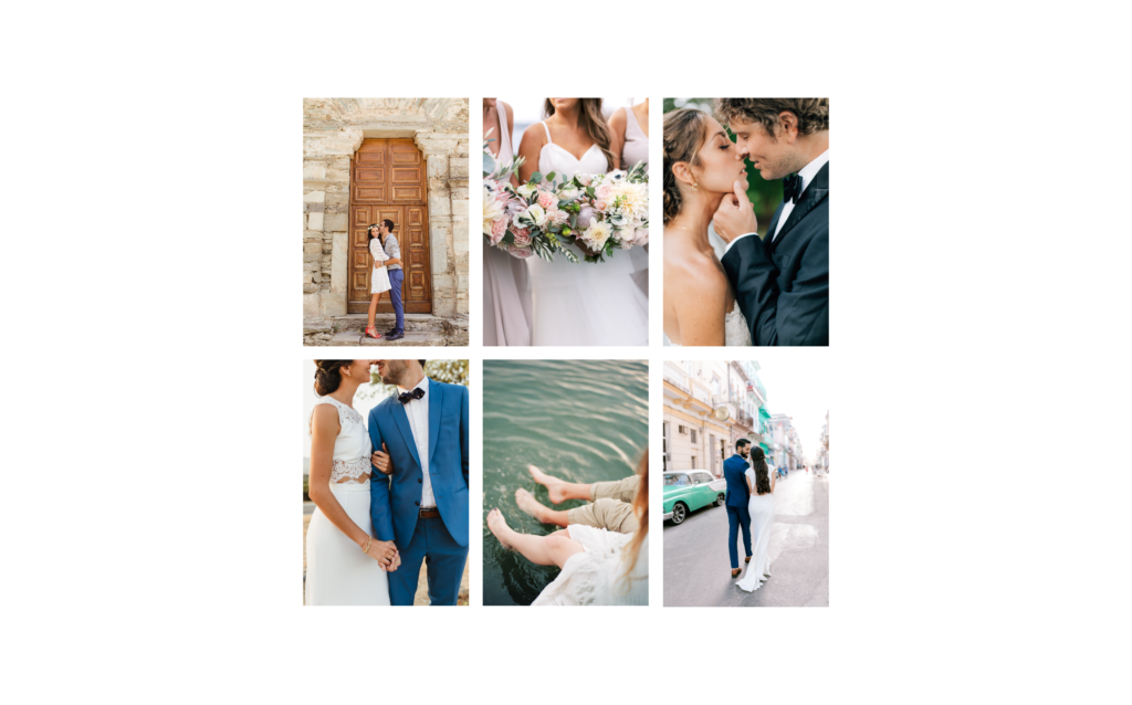
Here it is strategically curated for that globetrotting, sexy, and slightly boho couple…
Drastically different huh? She immediately had this sense of “omg that’s IT,” and so did I. And you know what?! So will her clients. And can you guess where she’s based? New England. Not, like, Bali (as these images suggest!) — shocking, I know!
How did we do this? Color story. Not showing too much. Positioning her best most iconic work front and center. Appealing to her ideal clients by choosing images that felt global, beachy, sexy, chic, editorial.
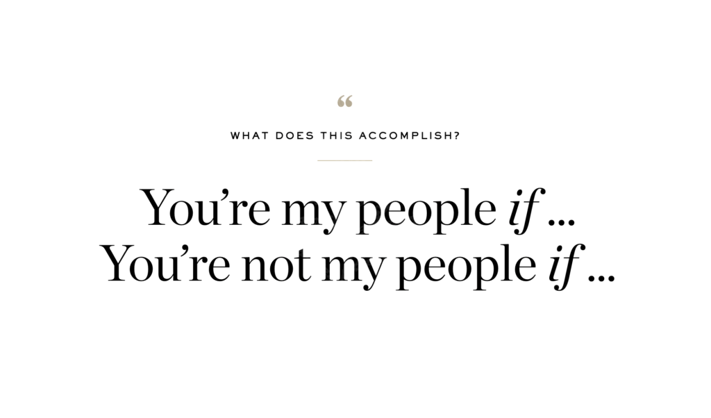
That’s the thing. You can strategically speak to and connect with your ideal clients via image curation and basically tell them: “You’re my people if … or you’re not my people if …” just by thoughtful selection.
And further, you can attract the types of clients and gigs you want by showing what you want to shoot in the future, as mentioned above. But let’s do a case-study now, shall we?
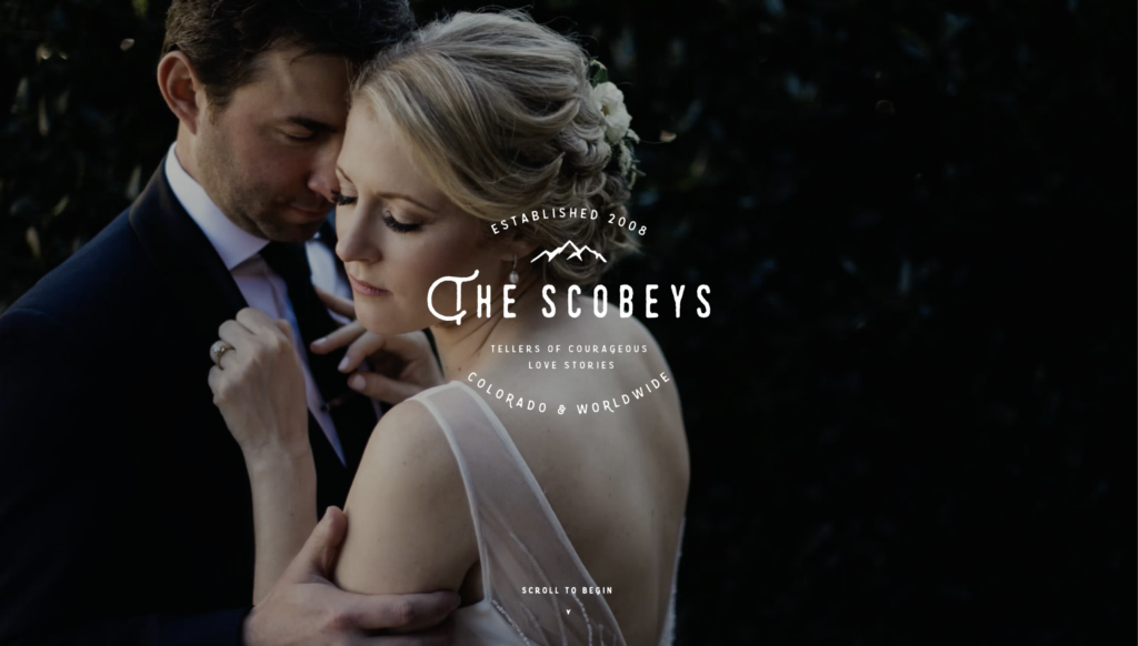
Exhibit A. The Scobeys.
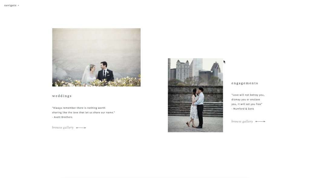
We actually designed their site ahead of their relocation and rebrand because their current work didn’t quite match up where they wanted to go. They were moving from Atlanta to Denver and were targeting a client and type of wedding that wasn’t present in their current body of work. Their style and soul behind their work was spot on, but the couples and the settings were not what they were after moving forward (as shown in the first screenshot). So, we curated what we could that offered an outdoorsy vibe still but had a lighter book to start with (second screenshot).
Literally two days after we launched, boom, like, three dream Colorado couples booked.
… and within six months they updated their images with signature mountainy work (seen below) that was perfect for their site and now continues to attract their perfect mountain-loving couples.
Ummm hello! That’s best-case scenario and ultimately what we’re all after right? And I’m telling ya what guys, curation is suuuuuch a huge part of that.
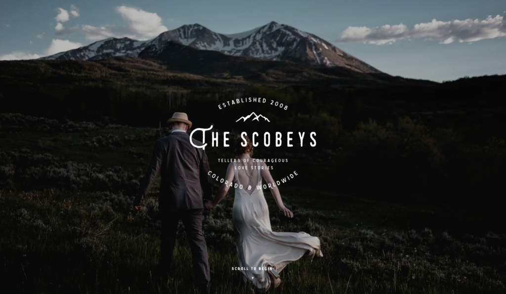
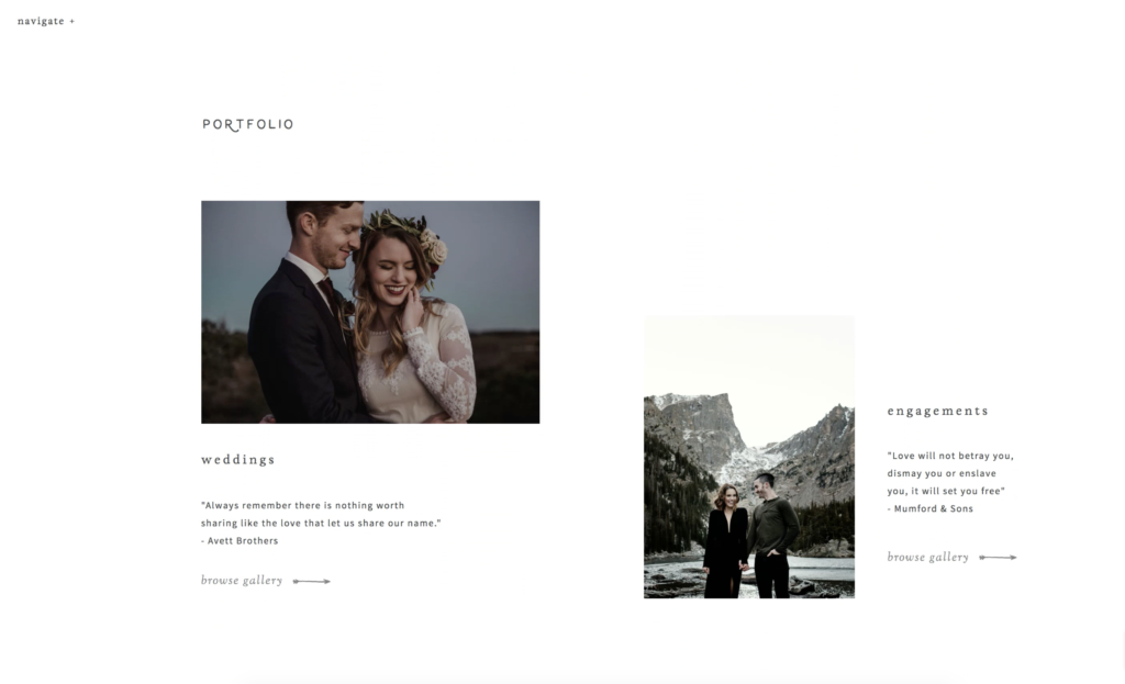
Image Integration
Now that your work is thoughtfully curated, it’s time to integrate it into your website, and if you did your homework well, this should be the fun part because you’ll see your website transform before your very eyes. Here are a few things you’ll want to keep in mind as you choose where to place your images.
Signature Imagery
I consider these to be any of the images used throughout the pages of your site that are fixed / static and very much front and center. The home page images, the hero images, the thumbnails, etc. All of these images combined really set the mood and vibe of your site and should further tell your brand story — from an aesthetic and a messaging perspective.
- Be sure that your color tones are consistent throughout and align with your brand’s color story. This consistency helps tie everything together, ensures your brand comes across as polished and refined, and just generally makes people more comfortable on your site since it’s so cohesive.
- You’ll want the images to connect with your overall messaging and with the specific copy throughout. Think, for example, if you wanted to attract a fun-loving, joyful bride but showcase a super dramatic, artful, and distant shot of a bride channeling her inner Tyra Banks. Banging photo? Sure. But targeted for that happy, giggly bride who’s super casual and laid-back? I think not.
Also, if you say “I’m for the off-beat and modern couple” in cool editorial type and put that over an image with a pearl-wearing bride in a ballroom, it’s a bit of a rub for the viewer because the two don’t connect. Be sure the images you pair with particular bits of copy relate to each other well so that that section packs even more punch. - Pair images thoughtfully to ensure variety in subject matter and composition but cohesion in terms of color and edit.
About Imagery
- The most effective way to ensure your about images are on-brand and help further your brand story is to approach creating them with intentionality and strategy and to then curate and place them thoughtfully.
- When it comes to having headshots and brand photography done, be sure to choose a photographer whose style aligns with yours so it ties in well to the other site imagery. Ensure their edit isn’t too far off of yours, and if it is, see if they can match yours or provide raw files.
- Show some range. No one needs to see a half-dozen headshots on your site, but rather show a range of you smiling, looking at the camera, working / creating, moving and living. This helps people connect with you as a person and allows them to see (and feel) what it’s like to work with you. Show them doing what you do, so they can imagine an experience with you.
Portfolio Imagery
Some common questions we get when it comes to building out your portfolio pages and showing your work:
How many images to include? For showcase / highlight galleries, I suggest 30-50 images. For featured / event or project-based galleries, I suggest anywhere between 50 and 75.
How do I prep them for Showit? As per Showit’s recommendations, it’s best to size them to 3500px on the long end. That will ensure they load quickly and look their best on all devices.
How do I choose a gallery style? All of our templates come with five standard gallery types. Tiled, Sliding, Editorial, Matted & Full Screen (with some bonus styles here or there depending on the design) and while you can certainly mix them up if you’d like, we think it’s best to choose one or two styles to use. Here’s what each works best for:
- Tiled. This is great for event or project-based galleries where you want to show a longer, more complete visual story. A featured wedding works great because the overall style of the images is typically more uniform and images tend to pair well together since they’re from the same shoot. OR say you’re an interior designer… you’d want to use this type of gallery to show a full range of your work throughout an entire project.
- Sliding. This is my go to gallery because it’s the most versatile and anything looks great in it. You can include both vertical and horizontal images so it’s easy to just drag and drop and move on with your life.
- Matted. This gallery type is for those who like a little more of a fine art, art gallery kind of look to their galleries. It offers more white space around your work and it’s not so large-scale and in your face. Lots of fine art wedding photographers or artists love this gallery type.
- Fullscreen. If you want high impact and full immersion, this is the gallery type for you. Works best for people with super sharp, high res files and bolder photography styles.
- Editorial. This is by far my favorite gallery style visually because it’s just so unique and different, but it is a little more cumbersome to build out since it requires some manual pairing and strictly vertical images. But it’s great for galleries with fewer images or to showcase a special project or series of images.
Filler + Stock Imagery
- While we’re huge fans of custom, made-for-you brand photography, we also know that’s not always possible or within the budget and you gotta rock some stock photography to fill in the blanks or tide you over until the next brand photoshoot. We’ve been using a bunch more stock imagery ourselves for our own site and social. You’ll even see stock image sets in several of our designs (Vieux Carre, Greyhound & Margarita), so we definitely know it’s possible to create something beautiful and tightly curated with stock imagery.
- We believe in this so much that we teamed up with one of our fave stock photography companies Social Squares for a special TONIC Regulars only free 14 day trial. How cool is that? Head here to get all the details.
- Beyond that, we have a bunch of other great sources for stock photography listed our TONIC Toolbox.
Whew. I know that’s a lot, but we really wanted to be sure to give you allllll the goods when it comes to image curation because we know it can be really difficult and yet, it’s so incredibly important. And when well-curated images are paired with great copy, you’re bound to create content that connects and land your dream clients.
Tune in later this week for Part 2 of Creating Content that Connects with Jen’s email on “How to Write Copy People Actually Want to Read” …
Happy image curating! As always, we’re here to help so feel free hit us up in the Facebook Group if you need any help with this part the process.
Cheers!
– Jeff